# Simone Sniekers — Style Reference
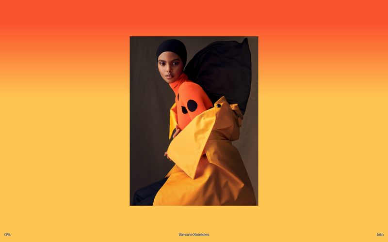
> A single editorial photograph breathes behind whisper-thin black captions — the image does all the work, the UI almost disappears.

**Theme:** light

Source measurements are normalized; roles and recommendations are interpreted. Font summary lists are independent, not paired by position. HTML examples are reconstructions, not source components.

Simone Sniekers is a photography portfolio stripped to its essence: the photograph is the interface. The site uses a single full-bleed editorial image as the entire canvas, with a barely-there UI layer of three text elements — a progress counter bottom-left, a name credit bottom-center, and an 'Info' trigger bottom-right. Typography is unified to one size and one weight across every UI element, treating all chrome as equal-weight caption text. The color palette is almost entirely photographic: warm amber, vermillion, and ochre washes bleed from the imagery itself, while the UI overlay sticks to black on whatever the photo presents. No cards, no borders, no shadows, no gradients in the traditional sense — the image provides all visual richness.