# Azione — Style Reference
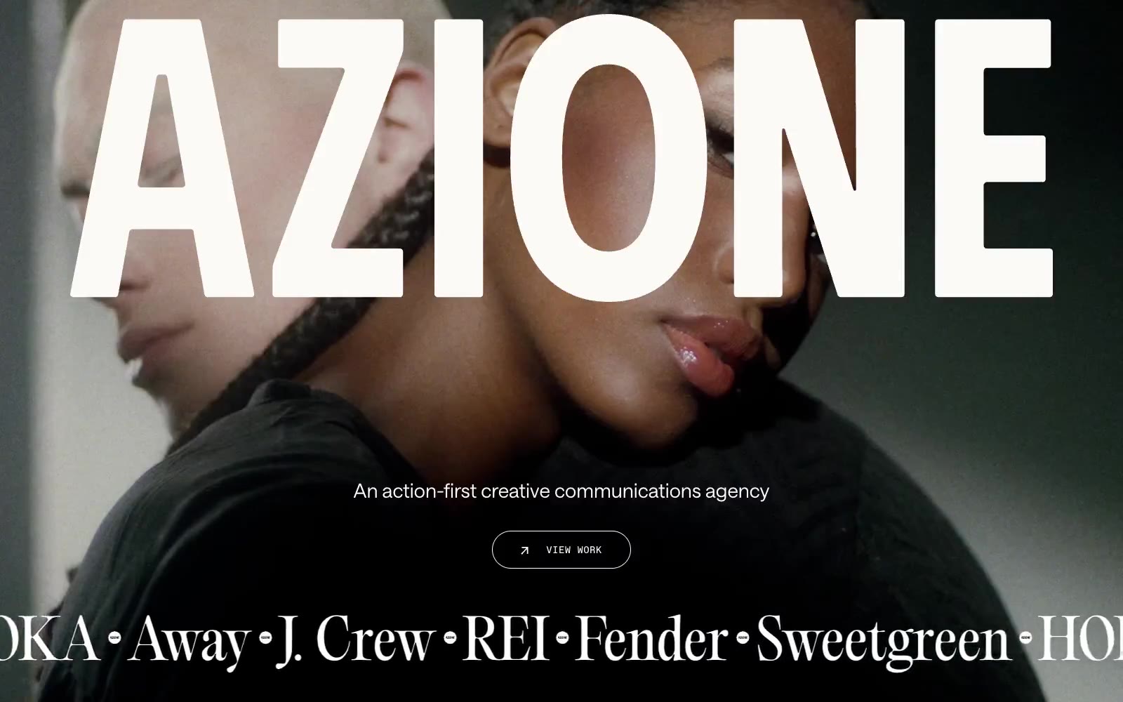
> Sunlit editorial diptych. Pair warm, imperfect campaign imagery with gallery-like typography and rust-colored information blocks.

**Theme:** light

Source measurements are normalized; roles and recommendations are interpreted. Font summary lists are independent, not paired by position. HTML examples are reconstructions, not source components.

Azione — sunlit editorial diptych. The interface pairs cinematic, full-bleed campaign photography with enormous cream wordmarks and delicate editorial-serif statements, then cuts to tightly framed image-and-copy panels in rust brown and off-white. Typography is deliberately triadic: PP Editorial Old carries dramatic cultural weight, Saans TRIAL handles concise human copy, and Favorit Mono turns navigation, labels, and controls into small technical annotations. Surfaces stay flat and tactile, with 16px rounded content containers, hairline cream rules on dark treatments, and color reserved for the rust information panels rather than universal controls.