# TeePublic — Style Reference
> Indie creator marketplace on white paper. A clean gallery wall where artist designs sit on bright cards, one signature blue links it all together, and the whole thing moves at the speed of discovery.

**Theme:** light

Source measurements are normalized; roles and recommendations are interpreted. Font summary lists are independent, not paired by position. HTML examples are reconstructions, not source components.

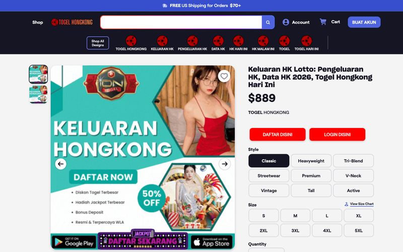
TeePublic's design system is a creator-commerce platform that feels like a community marketplace with editorial polish. The interface rests on a bright white canvas with deep midnight (#151523) text, one saturated violet-blue accent (#4e64df) that activates links, buttons, and rating systems, and a scale of cool grays for hairline borders and quiet surfaces. Typography pairs a geometric grotesque (Roobert) for UI and body with a sharper display face (SharpGrotesk) for headings, creating a hierarchy where product content stays readable and bold. Components are compact, border-driven rather than shadow-heavy, and rounded at 12px to feel friendly without being childish. The visual rhythm is dense and grid-based — product cards, tag chips, and style selectors repeat at a fast cadence, with generous use of pill shapes (100px radius) for navigation and a subtle rainbow gradient reserved for celebratory or premium moments.