# The1 — Style Reference
> building-scale typography on painted concrete

**Theme:** light

Source measurements are normalized; roles and recommendations are interpreted. Font summary lists are independent, not paired by position. HTML examples are reconstructions, not source components.

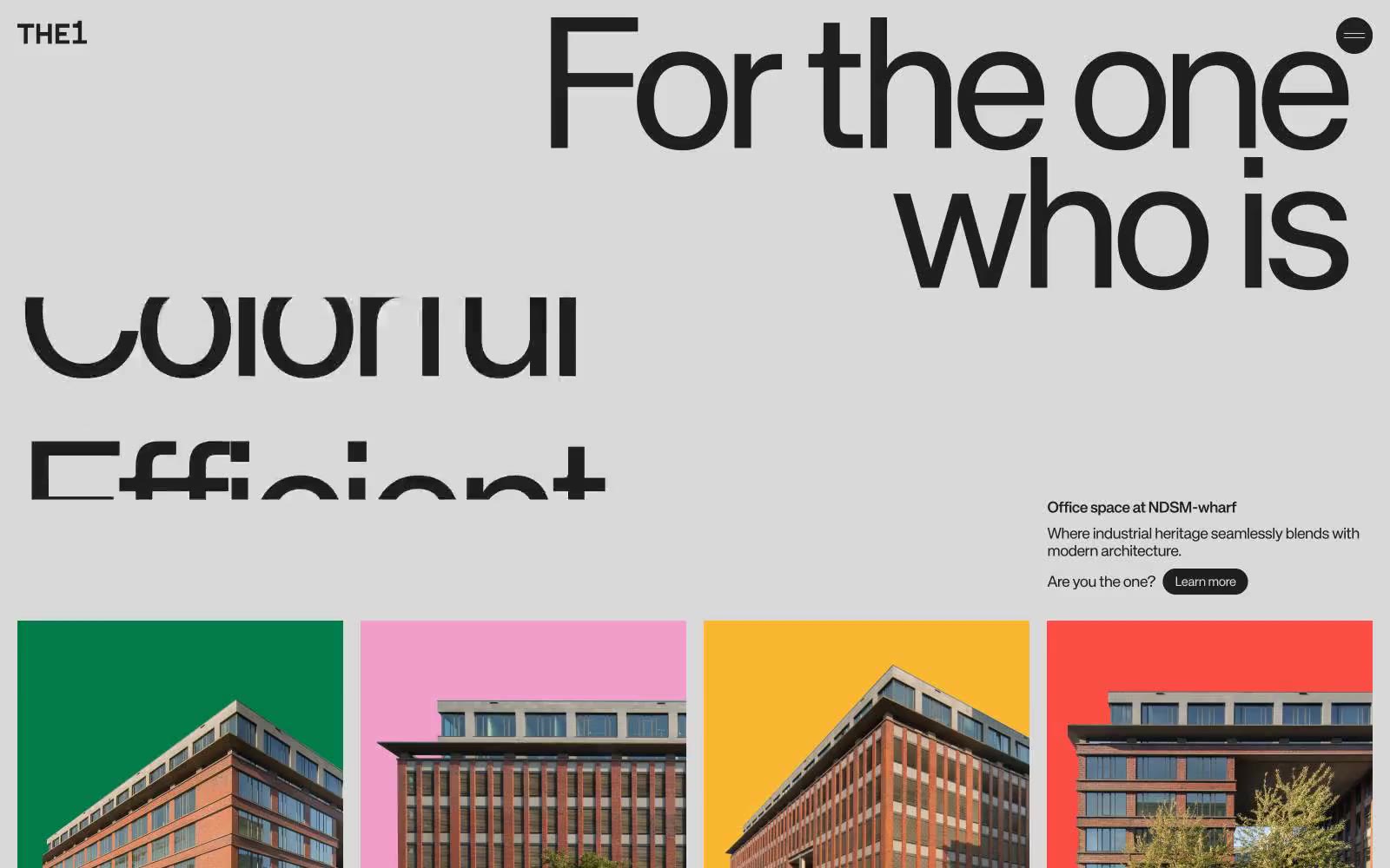
The1 is a typographic architecture system: a neutral concrete canvas (d9d9d9) beneath display type so large it becomes wall structure. The brand speaks through KH Teka set at architectural scale with crushed line-heights of 0.70–0.80 and negative tracking down to -0.06em, so letters collide vertically and horizontally to form facades rather than sentences. Four vivid paint colors — Green, Pink, Yellow, Red — function as a place-identity system, each one assigned to a property or moment and deployed as full-bleed color blocks behind contained photography. The interface is ruthlessly flat: no shadows, no gradients, no elevation, no decorative chrome. Navigation is a wordmark, a text line, and a single dark pill. Hairline near-black borders do the structural work that cards and shadows do elsewhere. A designer rebuilding this system should treat type as the primary surface, color as wayfinding, and the canvas as an empty gallery wall the type inhabits.