# Finn — Style Reference
> warm puppy-kissed comfort

**Theme:** mixed

Source measurements are normalized; roles and recommendations are interpreted. Font summary lists are independent, not paired by position. HTML examples are reconstructions, not source components.

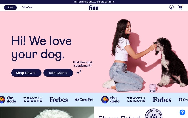
Finn is a warm, approachable pet wellness brand that feels like a friendly neighborhood vet clinic: cozy without being clinical. The interface rests on a white canvas with generous breathing room, anchored by a deep warm-brown #321004 used for nearly all type — unusual for modern e-commerce, where near-black dominates — and one decisive navy-violet #161345 that powers every button, dark section, and brand mark. Sections alternate between white card surfaces and full-bleed color washes (blush pink, sky blue, teal) that match the product flavor, giving each product line its own atmospheric room without diluting the brand voice. Typography pairs a humanist geometric (Larsseit) for body and UI with an extra-condensed display face (Athletics) for big headlines, the latter carrying wide tracking that gives the page editorial confidence. Components feel light and friendly: pill-shaped buttons at 60px radius, 20px-rounded cards with no visible borders, thin 1px gray hairlines, and almost no shadow — the system trusts color blocks and whitespace to separate layers rather than elevation.