# Essie Wine — Style Reference
> Dusty rose chapbook with mustard chapter breaks

**Theme:** mixed

Source measurements are normalized; roles and recommendations are interpreted. Font summary lists are independent, not paired by position. HTML examples are reconstructions, not source components.

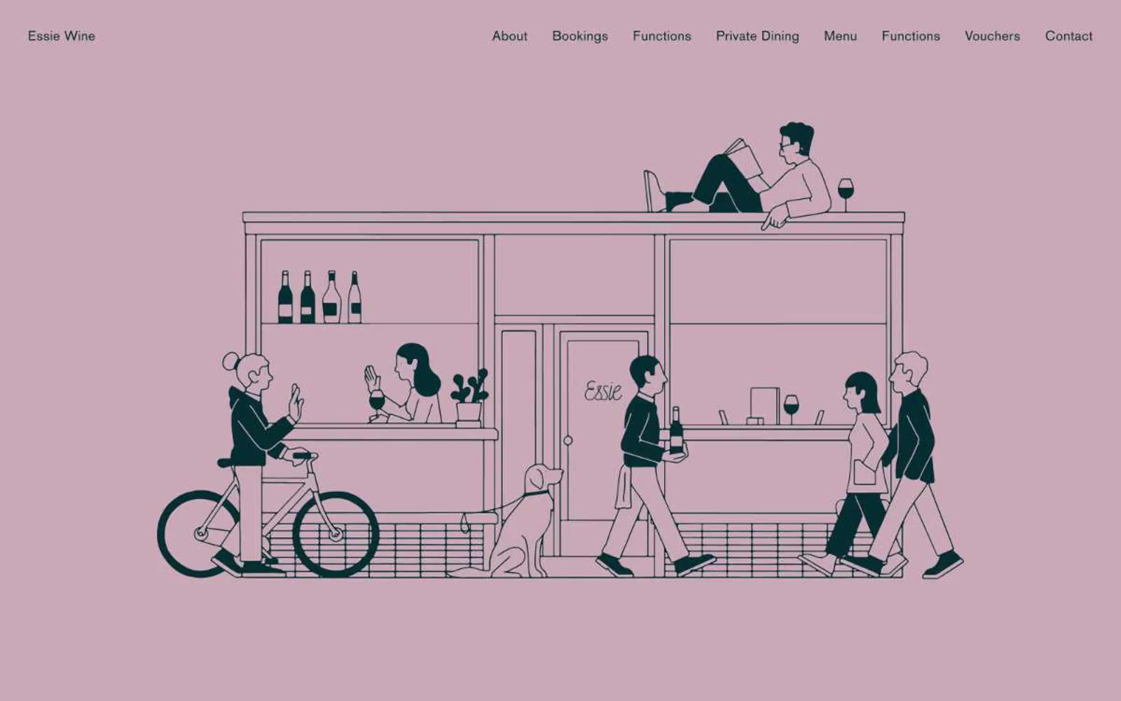
Essie Wine is an editorial neighborhood-wine-bar identity: three full-bleed color fields (dusty rose, warm white, mustard olive) stitched together by generous vertical breathing room and serif type that reads like a small magazine spread. Color is deployed as atmosphere, not accent — the entire page is the brand, and components are reduced to thin hairline rules, all-caps Elementa labels, and BasicCommercial serif body copy. The illustration in the hero is a single detailed line-art scene that does the storytelling work a SaaS site would delegate to feature cards and metrics. Interactions are quiet: ghost buttons, borderless inputs, no shadows, no gradients, no rounded corners — the only depth comes from section-to-section color shifts.