# VISIONNAIRE — Style Reference
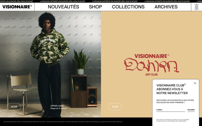
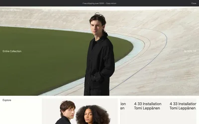
> Editorial streetwear gallery on bone-white. The brand behaves like a printed lookbook: flat white canvas, sharp black ink, and a single warm cream panel used as a colour-block stage for product or wordmark.

**Theme:** light

Source measurements are normalized; roles and recommendations are interpreted. Font summary lists are independent, not paired by position. HTML examples are reconstructions, not source components.

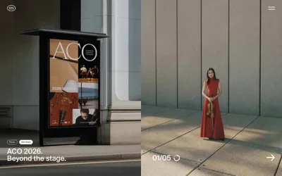
VISIONNAIRE is an editorial streetwear shop rendered as a gallery on bone-white: large-format photography, heavy uppercase tracking, and a stripped-down achromatic palette that lets garment prints and color-block hero panels do the visual work. The interface avoids chrome — no shadows, no rounded card stacks, no gradient washes — relying on hard edges, hairline rules, and a single warm cream (#f7f5e8) to break the black-on-white monotony. Pill buttons (50px radius) and generous letter-spacing on every label give the system a fashion-magazine cadence rather than a retail-grid feel. Product tiles are dense and uniform (4 across), prioritising catalogue breadth over white-space breathing room, and the entire chrome reads as uppercase, tracked, and slightly shouted — like a runway programme.