# Tuple — Style Reference
> Developer pair-programming workshop — clean white surfaces, one violet CTA, playful multi-color accents, and a dark band that makes the light sections breathe.

**Theme:** light

Source measurements are normalized; roles and recommendations are interpreted. Font summary lists are independent, not paired by position. HTML examples are reconstructions, not source components.

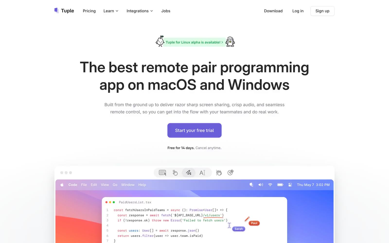
Tuple's design language is a developer's pair-programming workshop: bright, airy light surfaces with a single confident violet CTA that makes the primary action unmistakable. The visual identity leans on a four-color accent palette — violet, blue, orange, green — used sparingly as headings, icons, and the product-screenshot wallpapers, while the structural UI stays zinc-neutral and quiet. Typography pairs Inter Variable for everything functional with DM Mono for small all-caps labels and section eyebrows, which is a signature devtool move: mono labels say 'this is a product built by engineers' without resorting to skeuomorphism. Components are mostly flat and bordered rather than heavily shadowed, with a mix of 8px and 12px radii giving cards a modern-but-not-too-soft feel. The page alternates between generous white space sections and one dramatic dark band, creating rhythm without monotony.