# Sing-sing — Style Reference
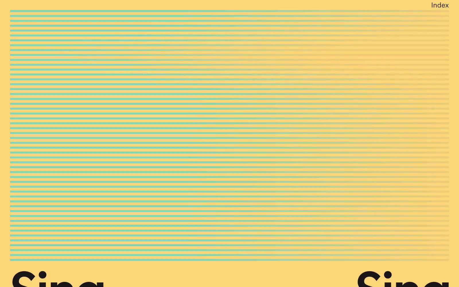
> butter-paper broadsheet at golden hour — a warm saffron canvas with sea-glass ink.

**Theme:** light

Source measurements are normalized; roles and recommendations are interpreted. Font summary lists are independent, not paired by position. HTML examples are reconstructions, not source components.

Sing-sing is a sunlit editorial system where the page itself is a warm saffron canvas and the interface sits on top like ink printed on butter paper. Color is structural, not decorative: teal sea-glass lines stripe the top of the page, bleed through a gradient, and underline the wordmark — the rest of the system is austere black type on yellow with no shadows, no cards, and no traditional UI chrome. Typography is the protagonist: a grotesk at near-poster scale (147px) with heavy negative tracking carries identity, while a smaller serif (signifier) plays a supporting role for editorial captions. Layout is art-directed, not gridded — each section behaves like a magazine spread, alternating between full-bleed photography, typographic statements, and the signature striped zone.