# Swap — Style Reference
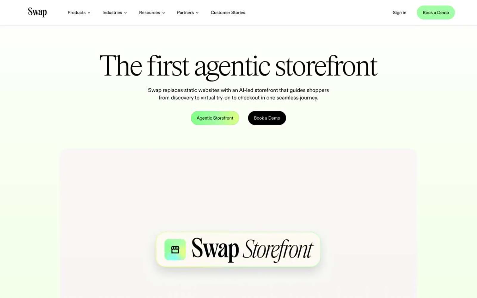
> Mint editorial greenhouse — pale sage rooms with vivid lime accents and whisper-weight serif type.

**Theme:** light

Source measurements are normalized; roles and recommendations are interpreted. Font summary lists are independent, not paired by position. HTML examples are reconstructions, not source components.

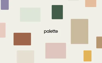
Swap's design is a pale-mint editorial canvas anchored by a high-fashion display serif and pill-shaped vivid green CTAs. The brand reads like a luxury fashion magazine spread digitized — generous whitespace, a barely-there sage wash, and lime-green accents that feel like fresh foliage against a near-white backdrop. Everything sits lightly: thin charcoal-black borders, soft 28px blur shadows, 24px card radii, and a custom display serif that shifts between ultra-thin (100) and light (300) to whisper rather than shout. The green-to-yellow gradient display text is the only moment of visual spectacle — the rest of the system stays restrained, monochrome, and editorial, with color appearing as small functional punctuation for primary actions, tags, and active states.