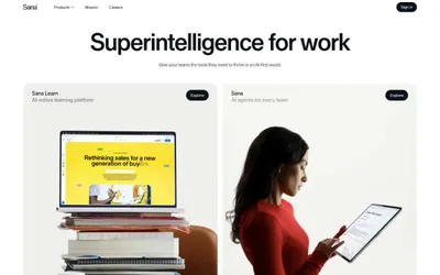
# Superintelligence for work — Style Reference
> Architectural monograph on vellum — where the only ornament is letter-spacing and the only color is a single electric blue pressed into white space.

**Theme:** light

Source measurements are normalized; roles and recommendations are interpreted. Font summary lists are independent, not paired by position. HTML examples are reconstructions, not source components.

Sana operates on near-total chromatic restraint: a monochromatic canvas of warm off-white, white, and a near-black ink, with one electric blue and one ember orange appearing only as functional punctuation on the single most important action per surface. The typography is the personality — Sana Sans set aggressively tight (-2.5% at display sizes) so headlines read as carved stone rather than rendered text, with weight staying between 400 and 500 to avoid shouting. Buttons are pill-shaped with large radii, cards are softly rounded, and the entire UI is flat — no shadows, no gradients, no decorative elevation. Sections alternate between white and #efefed bands to create rhythm without color, and the only depth comes from photographic content (editorial product still-lifes, full-bleed testimonial portraits) that floats on the otherwise silent canvas. The system behaves like an architectural monograph: one idea, one typeface, one material.