# Getharvest — Style Reference
> Golden hour workbench — warm cream canvas, white floating cards, and one vivid orange flame.

**Theme:** light

Source measurements are normalized; roles and recommendations are interpreted. Font summary lists are independent, not paired by position. HTML examples are reconstructions, not source components.

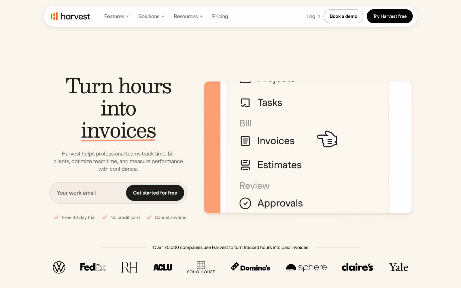
Harvest uses a sunlit productivity-workspace language: warm cream canvas (#fff8f1) replaces the typical SaaS white, giving every screen a golden-hour warmth, while white cards and panels float above that base for product surfaces. One vivid orange (#fa5d00) carries all the energy — every CTA, link, icon accent, and brand border — making it the only chromatic decision in an otherwise achromatic system of warm grays. Typography is confident and editorial: a geometric sans (MuotoWeb) for everything functional, with a serif display face (Monarch) reserved for hero-grade emotional moments. Components are soft and tactile: 16–20px radii, low warm-tinted shadows, generous breathing room, and decorative orange wash gradients that suggest movement without ever competing with content.