# TinyFaces NFT — Style Reference
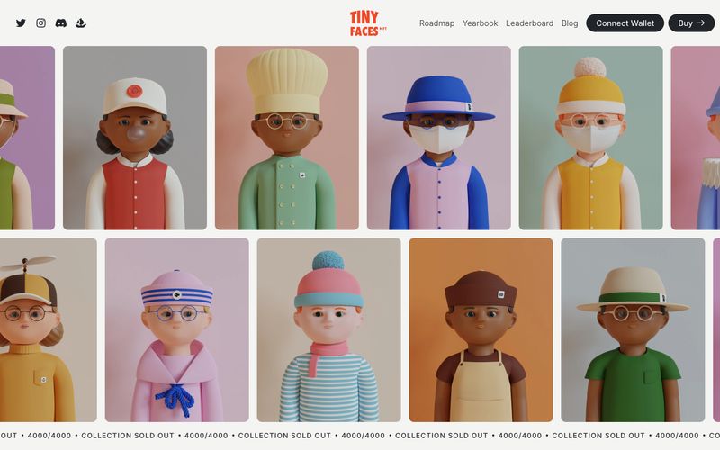
> Printed collector's catalog on warm paper. Imagine a heavyweight art-book spread where vivid vinyl-toy photography sits beside oversized editorial serifs and pastel-tinted feature panels — the interface is the binding, the characters are the exhibition.

**Theme:** light

Source measurements are normalized; roles and recommendations are interpreted. Font summary lists are independent, not paired by position. HTML examples are reconstructions, not source components.

TinyFaces presents a curated editorial aesthetic for an NFT collection: cream-paper canvas, oversized serif display type in Migra, and pastel-saturated feature cards that feel lifted from a printed collector's catalog. The 3D character renders are the stars — each one a tactile, toy-like portrait shot against muted, painterly backdrops (sage, periwinkle, blush, cream). The chrome stays disciplined and dark — charcoal text, hairline borders, pill buttons — so the colorful artwork and pastel cards can carry the energy. Accent orange-red (#ed4a29) is reserved for the wordmark, decorative borders, and as a thin callout underline, never as a dominant button fill. Headlines lean on italic emphasis within otherwise upright serif to add cadence without shouting. Spacing is compact and dense like a magazine spread, with 10px card radii that feel like printed page edges rather than glassmorphic panels.