# SaveDay — Style Reference
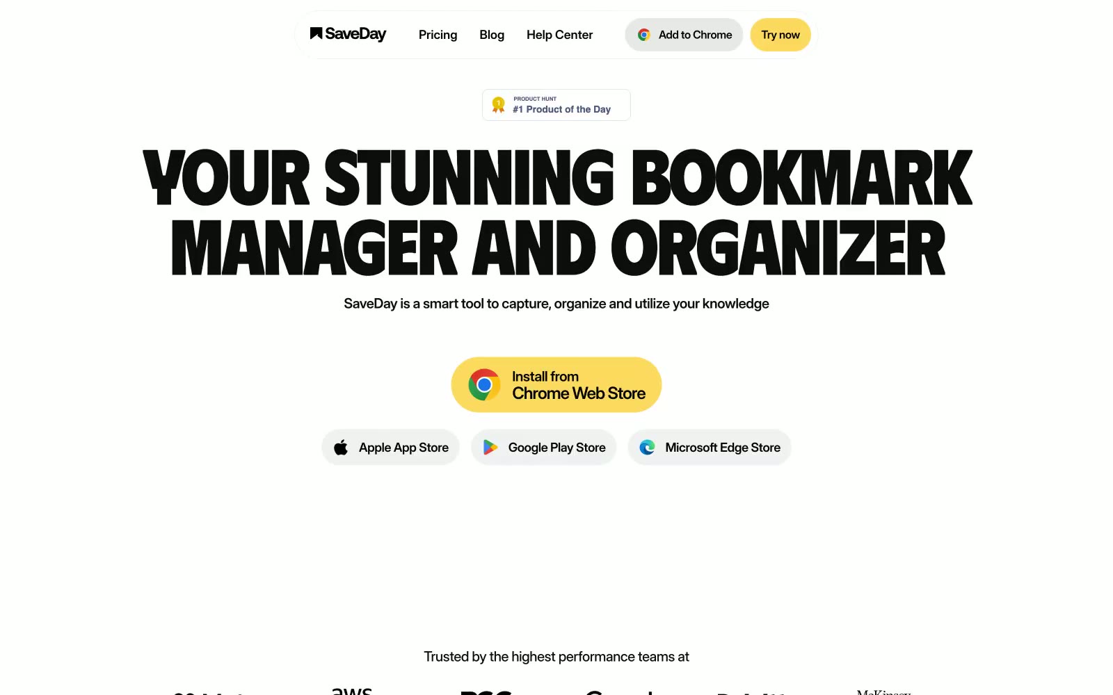
> butter-highlighter poster typography — oversize black uppercase type on cream paper, with one band of yellow dragged across each section.

**Theme:** light

Source measurements are normalized; roles and recommendations are interpreted. Font summary lists are independent, not paired by position. HTML examples are reconstructions, not source components.

SaveDay reads as a sun-bleached editorial spread with a butter-yellow highlighter dragged across it: a near-monochrome paper-white canvas, oversized uppercase display type in Phudu, and one saturated #fbda5f yellow that paints full-width section bands and pill accents. The system is unapologetically poster-like — headlines fill the viewport at 112px, letter-spacing pulls tight to -0.04em, and text alignment is almost always centered, producing a print-poster cadence rather than a dashboard cadence. Information is delivered in horizontal color bands (light gray, yellow, black) that act as section dividers and surface treatments in one move, with no shadows mediating depth. Components are confidently chunky: 24px card radii, 160px pill radii on CTAs and tags, hairline-thick black borders, and flat fills — the geometry does the work that gradients and shadows usually do.