# Gigantic — Style Reference
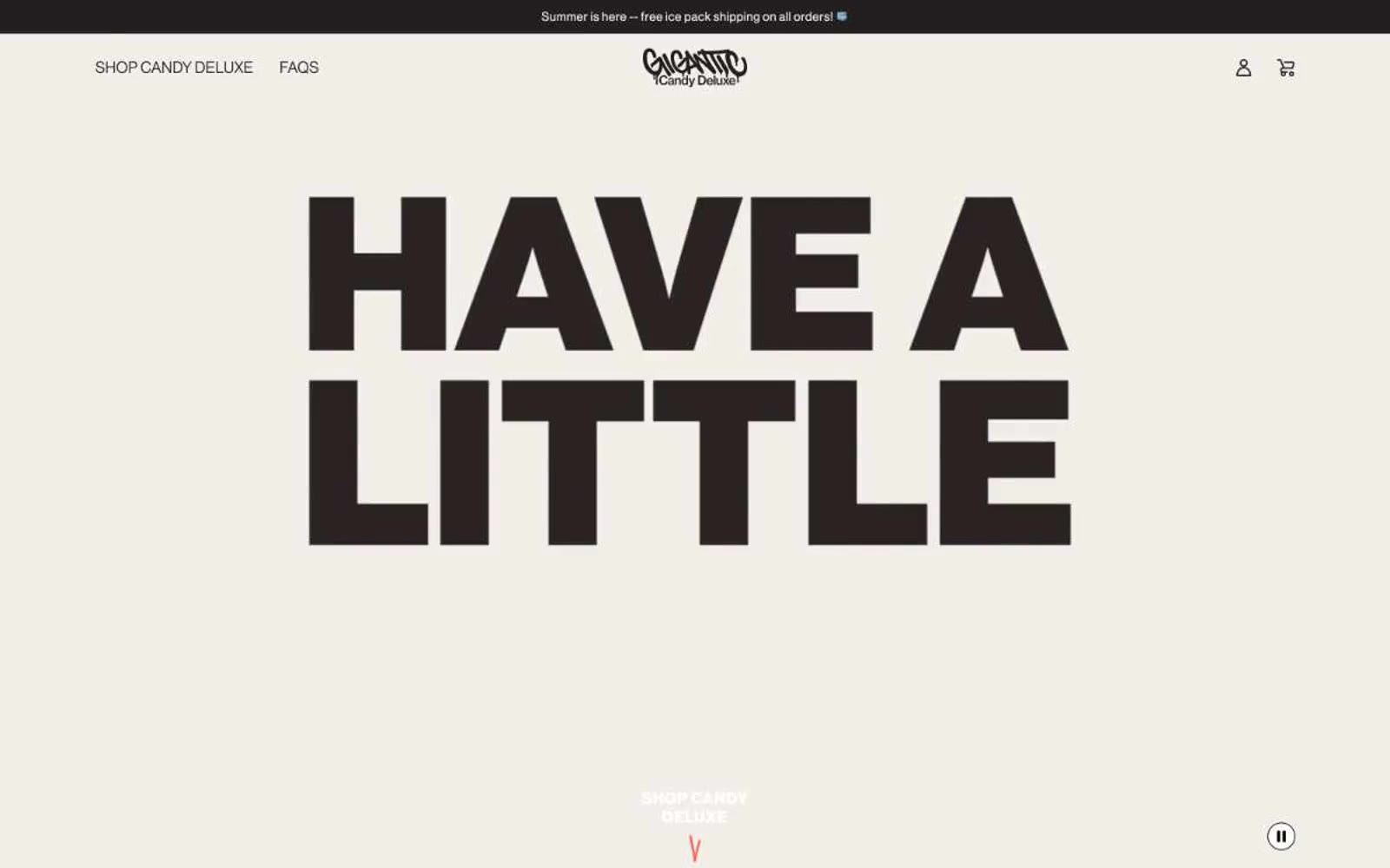
> punk-rock candy wrapper shouting on cream paper

**Theme:** light

Source measurements are normalized; roles and recommendations are interpreted. Font summary lists are independent, not paired by position. HTML examples are reconstructions, not source components.

Gigantic operates on a punk-rock confectionery visual language: an oversized headline voice shouting over warm cream paper, a single screaming orange-red accent, and packaging-forward product photography that treats each bar like a streetwear drop. The dominant near-black is the brand's primary action and text color — buttons are not colorful, they are assertive and monochromatic, with the orange-red reserved for product flavor coding, the footer wash, and the brand mark. Typography carries the energy: Neue Haas Grotesk Display set at near-display sizes, tracked wide and set heavy, so the type itself becomes the graphic. Whitespace is generous, the canvas is always warm (#f0ede7) rather than clinical white, and components stay flat — no shadows, no gradients, no glassmorphism — just bold ink on cream paper with a single loud accent.