# Mailchimp — Style Reference
> Vintage press meets electric yellow — an editorial print house with one neon switch.

**Theme:** light

Source measurements are normalized; roles and recommendations are interpreted. Font summary lists are independent, not paired by position. HTML examples are reconstructions, not source components.

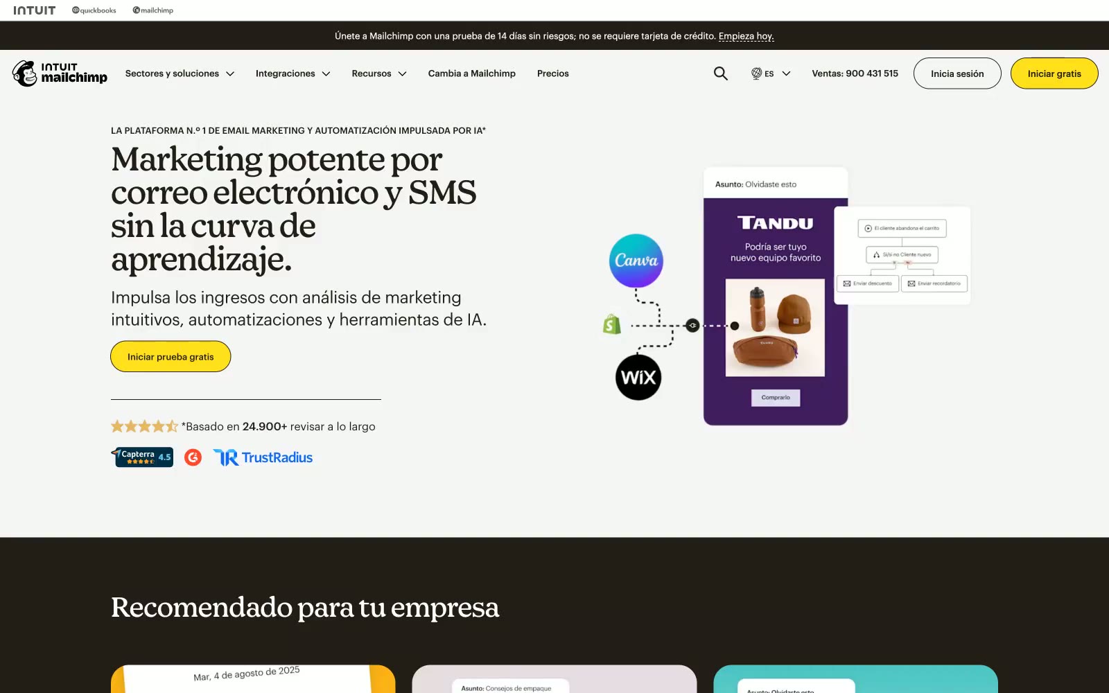
Mailchimp's visual language feels like a vintage newspaper printing house that discovered electric color — warm near-black (#231e15) dominates nearly every surface and typographic element, while a single voltage-yellow (#ffe01b) CTA button commands every page. The type system splits between Graphik Web (a geometric sans at tight -0.013em tracking) for all body/UI text and Means Web (a display serif-adjacent face at -0.021em) for headlines — a newspaper/magazine editorial duality that's rare in SaaS. Cards are flatly borderless or carry a soft warm shadow (rgba(35,30,21,0.15)), never the blue-tinted floating shadows common to other platforms. Section backgrounds alternate between #ffffff, #f5f5f5, the warm cream #ebe1cd, and near-black #231e15, creating a banded editorial rhythm. The pill CTA (26px radius, yellow fill, dark stroke, dark text) is the one rounded form in a system that otherwise uses 3px or zero radius everywhere.