# Shelby Kay — Style Reference
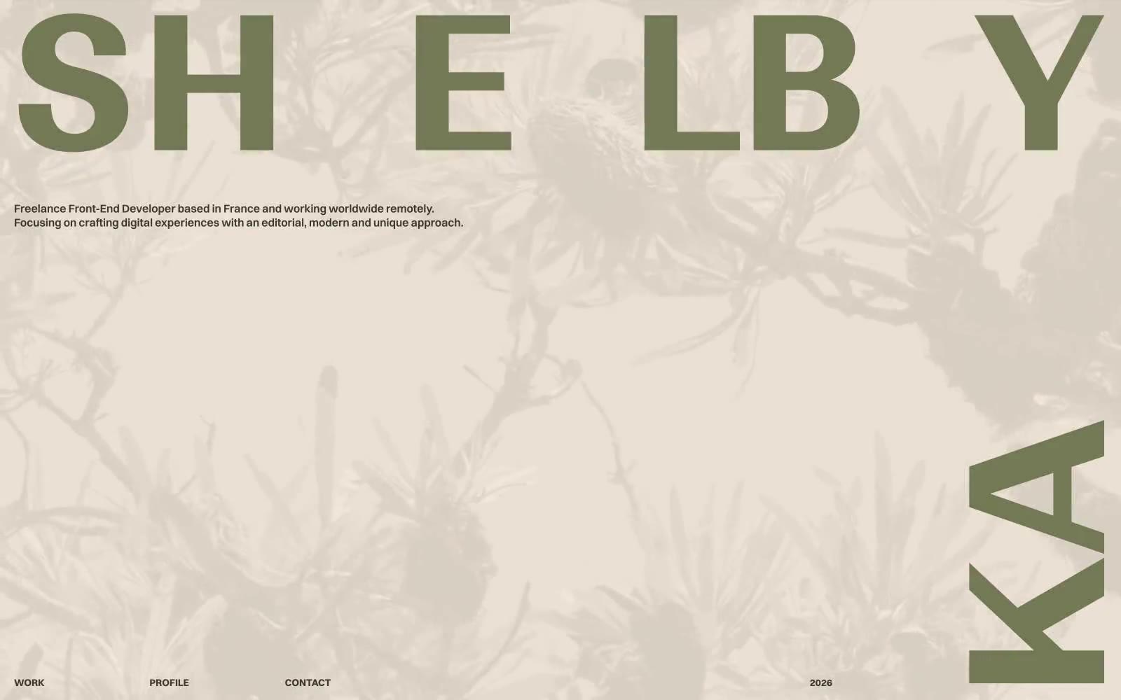
> botanical editorial spread on warm linen — two-color ink system on aged paper, with display type that bleeds past the page edge and metadata that whispers from the margins.

**Theme:** light

Source measurements are normalized; roles and recommendations are interpreted. Font summary lists are independent, not paired by position. HTML examples are reconstructions, not source components.

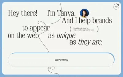
Shelby Kay is a botanical editorial portfolio: a warm linen canvas, one dark-olive ink color, and a single sage-green accent that does all the brand expression. Typography is extreme — Ranade display type stretches to 265px and bleeds edge-to-edge, while Switzer handles everything else at a compact 10–20px range, creating a magazine-spread tension between monumental headers and whispering metadata. Navigation is text-only with no buttons, no rounded controls, no shadows — the interface reads as a printed art book, not a software product. Sections shift through warm tonal layers (cream → tan → taupe) rather than alternating hard color blocks, and the overall system rewards restraint: hierarchy comes from scale, weight, and whitespace, never from color or chrome.