# Varo Bank — Style Reference
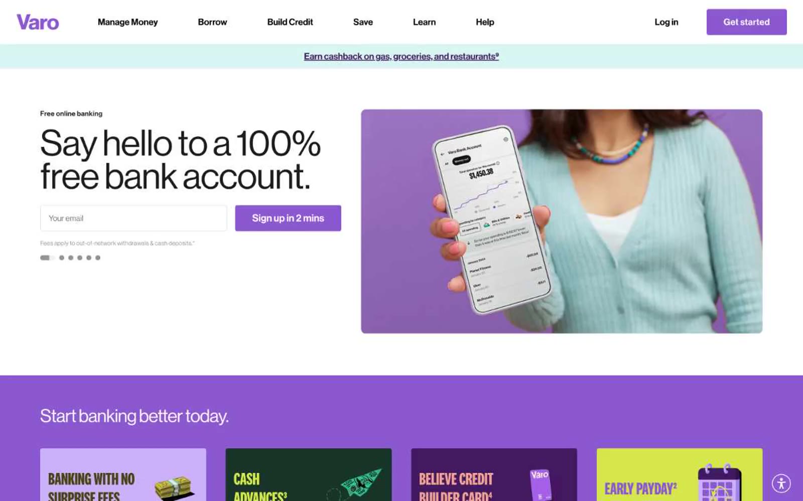
> neon bank statement on a sticky note — bold compressed type punched onto bright colored cardstock, held together by hairline black outlines

**Theme:** light

Source measurements are normalized; roles and recommendations are interpreted. Font summary lists are independent, not paired by position. HTML examples are reconstructions, not source components.

Varo Bank reads like a confident consumer-finance poster series printed on colored cardstock: pure white canvases interrupted by full-bleed bands of violet, lime, coral, and cream, each carrying chunky ultra-compressed display type. The visual system is deliberately loud — National 2 Compressed at 96–147px drives every headline with near-zero leading, making text behave like a graphic block rather than prose. A single saturated violet (#8c58d0) is the only true interactive color; everything else chromatic is decorative atmosphere, and the only neutrals that matter are true black and white. Borders are hairline and dark, radii are universally 4px, and shadows are absent — depth comes from flat color collision, not elevation. The whole product feels Gen-Z native: playful, financial-literacy-forward, and graphically assertive without feeling corporate.