# Recess — Style Reference
> pastel sunset over a swimming pool

**Theme:** mixed

Source measurements are normalized; roles and recommendations are interpreted. Font summary lists are independent, not paired by position. HTML examples are reconstructions, not source components.

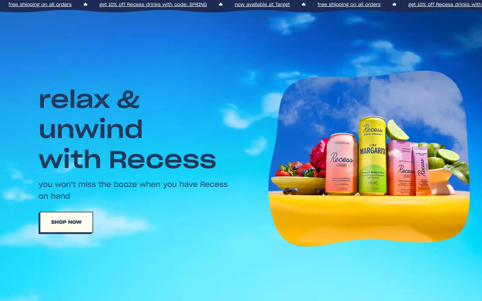
Recess lives in a daydream of pastel skies: soft periwinkle canvases, peach-pink horizon glows, and floating cloud shapes create an atmosphere of deliberate calm rather than commerce. The brand speaks through one confident geometric sans-serif (Sharp Grotesk) paired with a script logo lockup — the contrast between structural type and hand-drawn mark defines the personality. Color is mood, not decoration: deep navy ink carries all text, a single vivid blue punctuates emphasis, and the rest of the palette is washed-out lavender, cream, and coral that feel like the inside of a sunset. Components are low-elevation and quietly rounded — borders and soft fills do the work, not shadows. The layout is centered, generous, and breathing-room heavy, with a horizontal marquee banner at the very top and content that always feels like it could be a magazine spread.