# Svelte — Style Reference
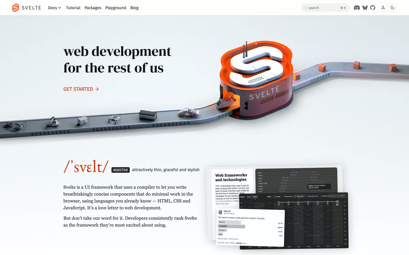
> Editorial broadsheet on white marble — serif voice, single ember accent

**Theme:** light

Source measurements are normalized; roles and recommendations are interpreted. Font summary lists are independent, not paired by position. HTML examples are reconstructions, not source components.

Svelte's site reads like a literary broadsheet translated into a framework landing page. Serif typography — EB Garamond for running text, DM Serif Display for hero headlines — carries the voice while a tight sans-serif (Fira Sans) handles the chrome: nav, buttons, tags, search. The canvas is pure white, surfaces are rare, and elevation is almost nonexistent; hierarchy comes from type size and weight rather than cards or shadows. A single vivid orange (#d43008) punctuates the monochrome page: it owns the logo, the GET STARTED arrow, the /svelte/ wordmark, and the documentary link. CTAs are arrow-suffixed text links, never boxed buttons. The site breathes — generous vertical rhythm, centered serif headlines, grayscale sponsor logos, and very little ornamentation between sections.