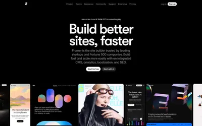
# Webflow — Style Reference
> white studio, black ink, one blue mark — a designer's drafting table rendered as a web page.

**Theme:** light

Source measurements are normalized; roles and recommendations are interpreted. Font summary lists are independent, not paired by position. HTML examples are reconstructions, not source components.

Webflow presents a studio-grade design platform language: a stark white canvas, near-black type, and a single saturated blue that punctuates the interface with quiet authority. Headlines speak at monumental sizes (56–80px) in a custom geometric variable sans, carrying tight negative tracking that makes each character feel chiseled rather than typeset. The visual rhythm is generous — large vertical breathing room between sections, cards floating on soft 8px radii with barely-there shadows, and product imagery embedded in realistic browser chrome to demonstrate capability rather than describe it. Color discipline is extreme: the palette is almost entirely achromatic, with the brand blue (#146ef5) reserved for primary actions, active states, and link emphasis, and the entire chromatic spectrum compressed to just two more hues (a soft green and warm orange) that appear only in micro-illustration contexts.