# Fonts In Use — Style Reference
> White gallery wall for letterforms

**Theme:** light

Source measurements are normalized; roles and recommendations are interpreted. Font summary lists are independent, not paired by position. HTML examples are reconstructions, not source components.

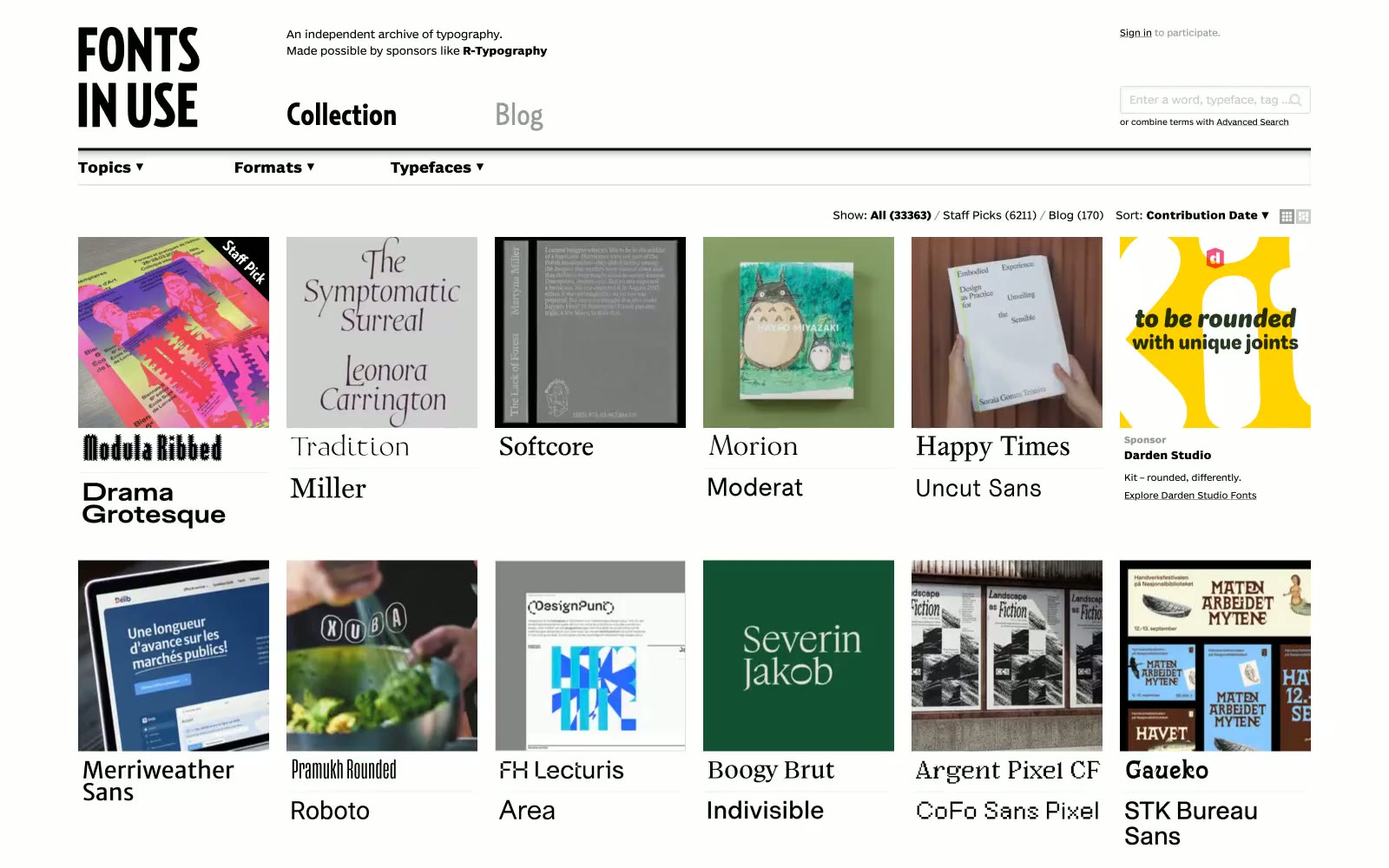
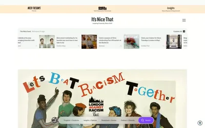
Fonts In Use operates as a typographic museum: an editorial archive where the interface is deliberately invisible so the letterforms being catalogued can speak. Every surface is white or near-white, every stroke is black, and the only typographic personality comes from the custom BentonSansRE UI sans and RelayCond display — never from decoration. The 5-column thumbnail grid functions as the page's primary content unit, each card pairing a photographic evidence image with a live sample of the typeface it documents (Baste, Proxima Nova, Zilla Slab…). Density is compact and newspaper-like rather than spacious-SaaS: tight vertical rhythm, 5px gaps, hairline 2px radii on controls, no shadows, no gradients, no accent color. The whole system reads as a printed specimen sheet rendered for the screen — restrained, factual, anti-decoration.