# VITURE — Style Reference
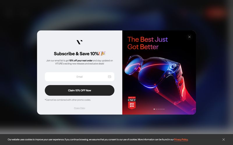
> neon product stage behind midnight glass — a blacked-out showroom where one orange beam cuts through the dark to illuminate a pair of glasses on a pedestal.

**Theme:** mixed

Source measurements are normalized; roles and recommendations are interpreted. Font summary lists are independent, not paired by position. HTML examples are reconstructions, not source components.

VITURE projects a premium consumer-electronics showroom: near-black canvases, photographic product stages lit with neon rim-lighting, and one searing orange accent (#ff5f34) that acts as the brand's heartbeat across links, emphasis text, and filled CTAs. The interface is intentionally restrained — a single custom geometric sans-serif (FontSeasonSans) carries the entire typographic voice, from 12px captions to 340px hero numerals, with positive letter-spacing that widens as type grows, giving display text an airy, almost holographic openness. Surfaces are flat and confident: pure white and pale grays for content cards, deep #0c0c0c for product showcases, and pill-shaped controls (9999px radius) that feel tactile and modern. Rounded cards (28px) and full-bleed gradient washes (orange-to-purple, blue-to-cyan) inject the futuristic XR energy without cluttering the UI.