# Luffu — Style Reference
> Family almanac printed on cream linen — editorial restraint meets intimate warmth, executed in two weights of a single serif-adjacent type system on a near-parchment ground.

**Theme:** light

Source measurements are normalized; roles and recommendations are interpreted. Font summary lists are independent, not paired by position. HTML examples are reconstructions, not source components.

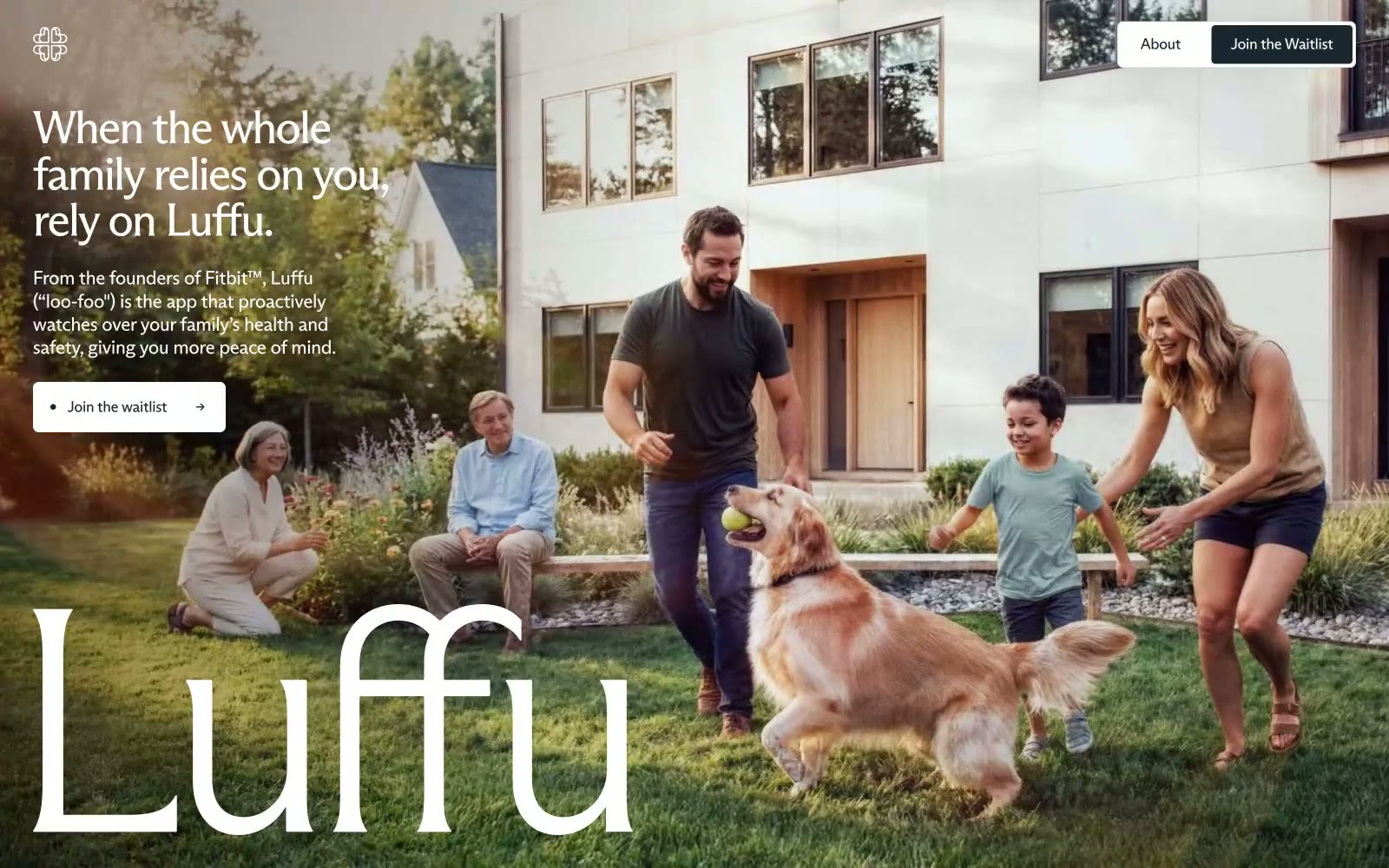
Luffu feels like late afternoon sun through a kitchen window — warm, unhurried, intimate. The cream-tan background (#f5f5ee) and near-black text (#2f3136) create a paper-and-ink warmth far from the cold blues of health tech. Two custom ABC Arizona typefaces do the heavy lifting: Flare at massive display sizes with -0.05em letter-spacing renders the brand name as a piece of editorial typography, while Sans handles navigation and body with similar optical tightening. The hero is full-bleed lifestyle photography — a real family, natural light, golden retriever — with oversized logotype overlaid at near-opacity, bleeding into the image. Color restriction is extreme: no accent color anywhere, just dark ink, warm cream, and white, with a single dark-teal (#192830) reserved for the primary CTA button.