# Cron Calendar — Style Reference
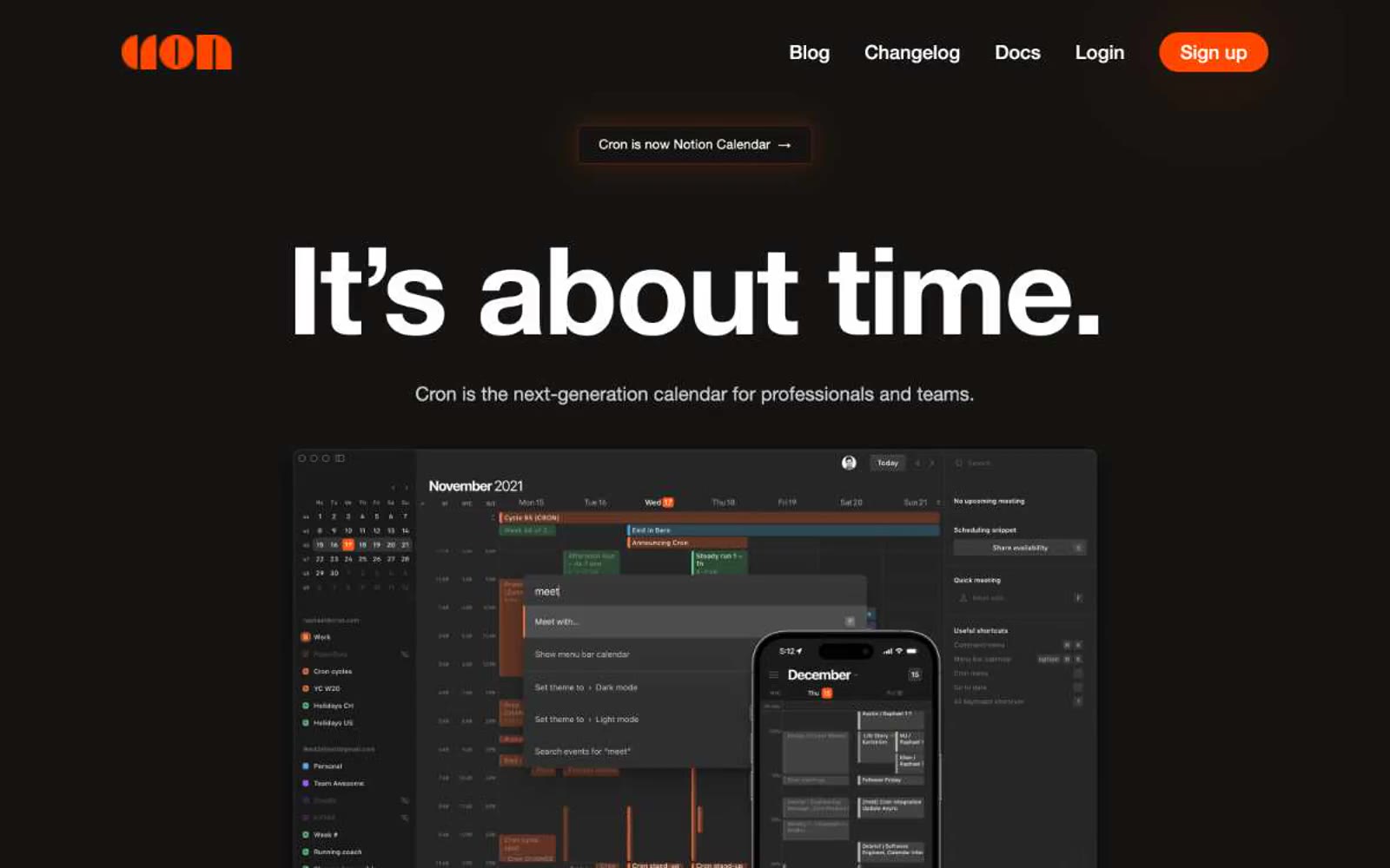
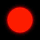
> Ember in an obsidian void — one warm orange spark burning against a near-black canvas.

**Theme:** dark

Source measurements are normalized; roles and recommendations are interpreted. Font summary lists are independent, not paired by position. HTML examples are reconstructions, not source components.

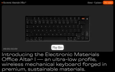
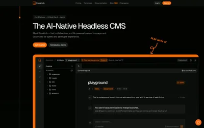
Cron uses a near-monochrome dark canvas with a single ember-orange accent — the visual logic of a luminous clock face in an unlit room. Almost every surface, border, and text element lives in a narrow band of near-black, warm-gray, and white, reserving #ff4700 exclusively for primary actions and brand moments. Type does the heavy lifting: a single 140px display headline at weight 700 with aggressive negative tracking commands the hero, while the rest of the system stays at 13–22px Helvetica Neue. Components are stripped to essentials — a pill-shaped nav chip, a glowing filled CTA, hairline borders, and product screenshots that float on the dark canvas. There are no gradients, no decorative illustrations, and no secondary hues: the design earns its identity through contrast, scale, and restraint.