# Preply — Style Reference
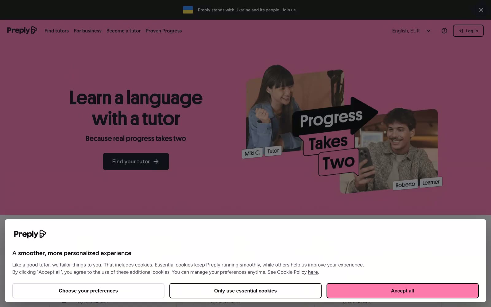
> Pink billboard with human stickers

**Theme:** light

Source measurements are normalized; roles and recommendations are interpreted. Font summary lists are independent, not paired by position. HTML examples are reconstructions, not source components.

Preply projects a warm, confident energy built on saturated pink hero canvases, near-black typography, and white product surfaces. The visual system is deliberately loud in the top fold to express brand personality, then quiets down into a calm black-and-white catalog of tutors and content once the user moves into functional areas. Platform (a chunky, high-contrast display face) carries all headings at weight 700 with very tight tracking and line-heights, making 48–96px headlines read as solid blocks of voice rather than delicate type. Figtree handles all UI and body text at moderate weights with slightly looser tracking. Components are flat and rectangular — 4px and 8px corners are the only soft edge in the system, and shadows are nearly absent. Photography is integral: real tutor/learner portraits are cropped, slightly rotated, and layered with black text stickers, giving the brand a handmade, scrapbook-like quality that contrasts the structured grid below.