# Klarna ES — Style Reference
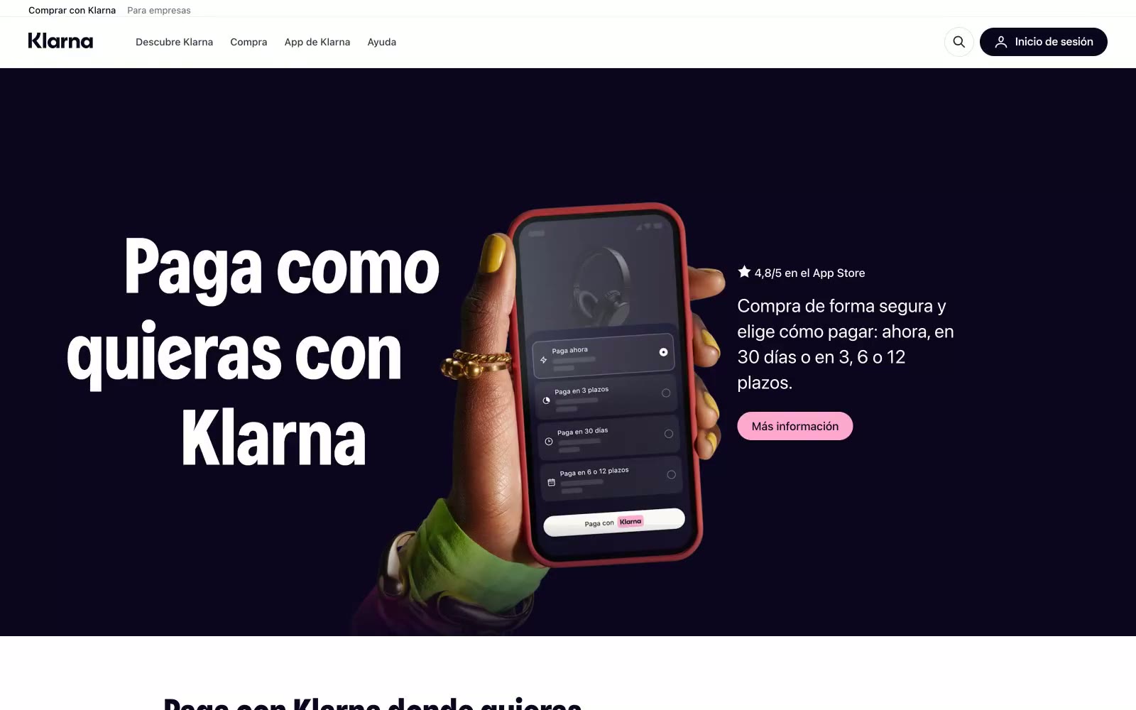
> midnight gallery with candy accents — a near-black plum void opens onto a warm bone-white floor scattered with vibrant product cards, anchored by oversized geometric type and pill-shaped controls.

**Theme:** light

Source measurements are normalized; roles and recommendations are interpreted. Font summary lists are independent, not paired by position. HTML examples are reconstructions, not source components.

Klarna's visual system is a confident dark-meets-light duality: a near-black plum (#0b051d) anchors brand presence across the hero and display type, set against a warm bone-white canvas (#f9f8f5) that keeps content sections approachable rather than clinical. Oversized custom display typography at 90px commands the hero, while compact body text at 16px stays quiet and legible. Playful accent colors — bubblegum pink, lavender, lime, deep plum — appear as small punctuation on cards and CTAs, never as structural or background elements. Generous rounded corners (16-32px on cards, pill-shaped buttons), near-zero shadows, and hairline borders create a premium, almost gallery-like feel where depth comes from color contrast and scale, not from elevation.