# Deezer — Style Reference
> Festival poster meets dark arena

**Theme:** mixed

Source measurements are normalized; roles and recommendations are interpreted. Font summary lists are independent, not paired by position. HTML examples are reconstructions, not source components.

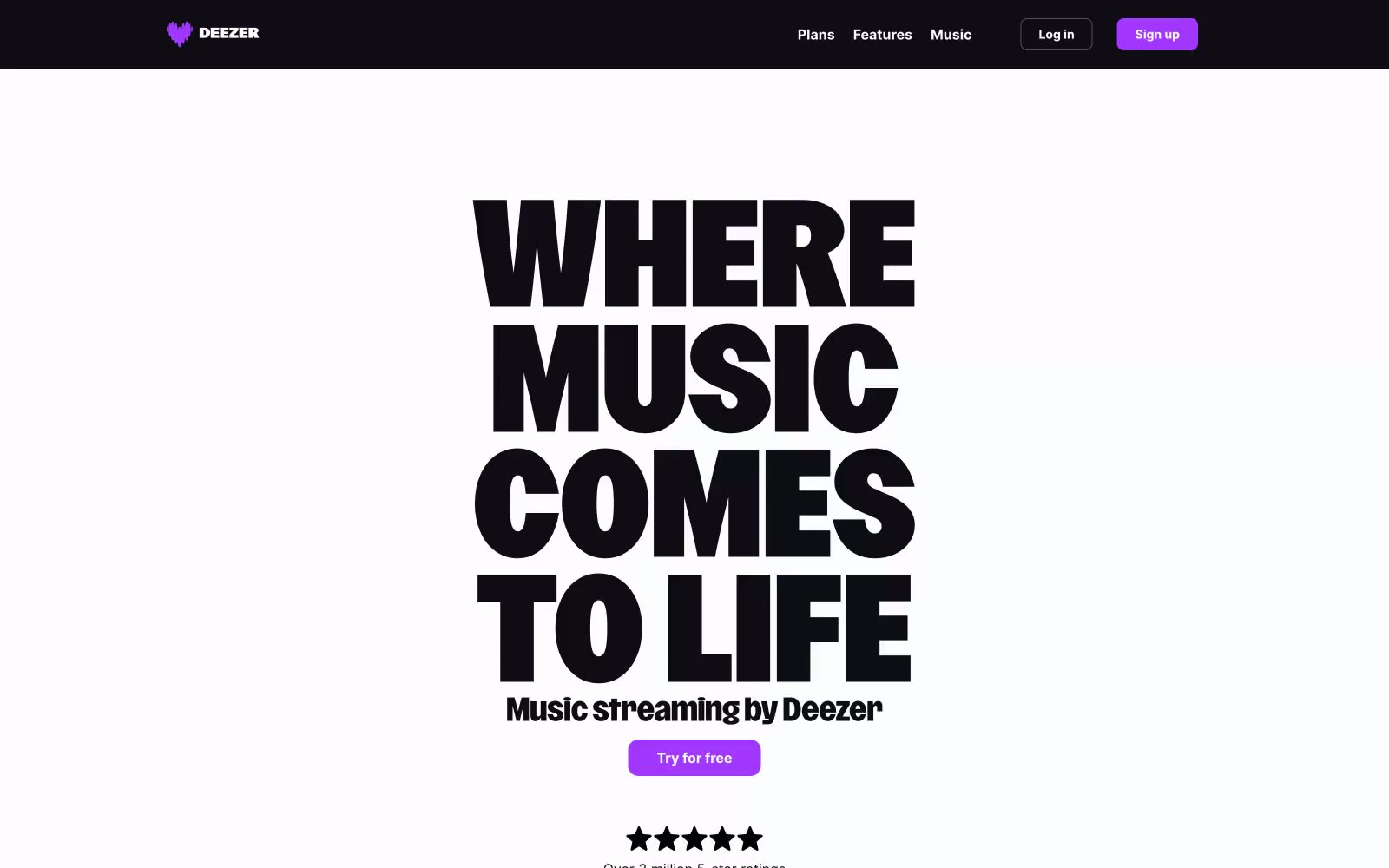
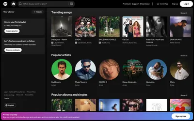
Deezer's visual system is a dramatic concert-poster language: a sunlit white hero dominated by a single ultra-condensed display headline, followed by dark arena sections where content floats on light card surfaces against near-black backgrounds. Typography carries the entire brand voice — a custom 700-800 weight display face with absurdly tight line-heights (0.71–0.90) that makes the hero feel like a music festival flyer, not a SaaS page. One vivid violet (#a238ff) is the only chromatic note across the system, used with discipline: filled CTAs, pill badges, and the top promotional banner. The palette is otherwise near-monochrome — stark black on white for the hero, near-black with white text for the lower arena, and a single soft lilac for subtle washes. Components are light, flat, and confident: pill-shaped buttons, thin dividers, no decorative shadows, no gradients. The rhythm alternates light/dark bands vertically to create contrast between marketing drama and product clarity.