# Chantlings — Style Reference
> Candlelit cave, ember in the void

**Theme:** dark

Source measurements are normalized; roles and recommendations are interpreted. Font summary lists are independent, not paired by position. HTML examples are reconstructions, not source components.

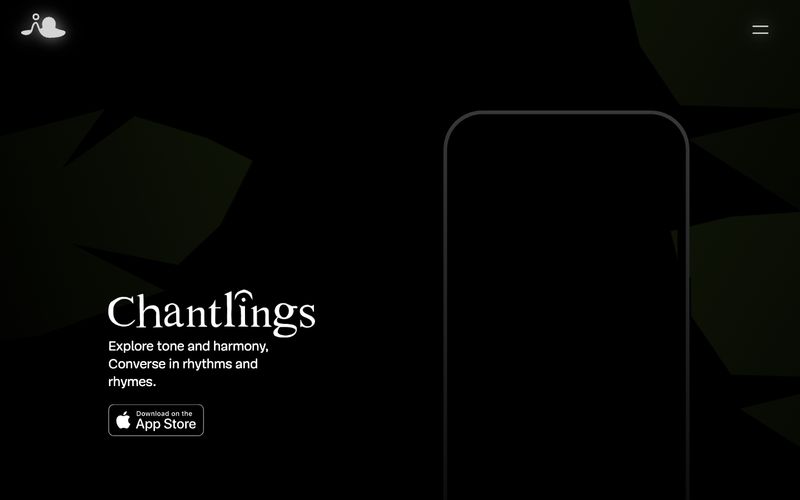
Chantlings lives in near-total darkness — a cinematic, candlelit void where warm amber punctuations glow against deep charcoal. The entire interface is built from three near-black neutrals and one whisper-quiet serif (Mija) used exclusively at weights 100 and 300, which gives every word the quality of breath or breath-of-sound. Color appears only as a single warm flicker: the App Store badge border, the creature's eyes, the faintest hint of a button fill — never decoration, always a tiny signal of life. Layout breathes with extreme generosity (100–196px horizontal padding, 65–100px section gaps), and surfaces are essentially flat with hairline borders, never elevated by shadow. The result is an intimate, almost ceremonial product page that treats negative space as a primary material.