# Leandra-isler — Style Reference
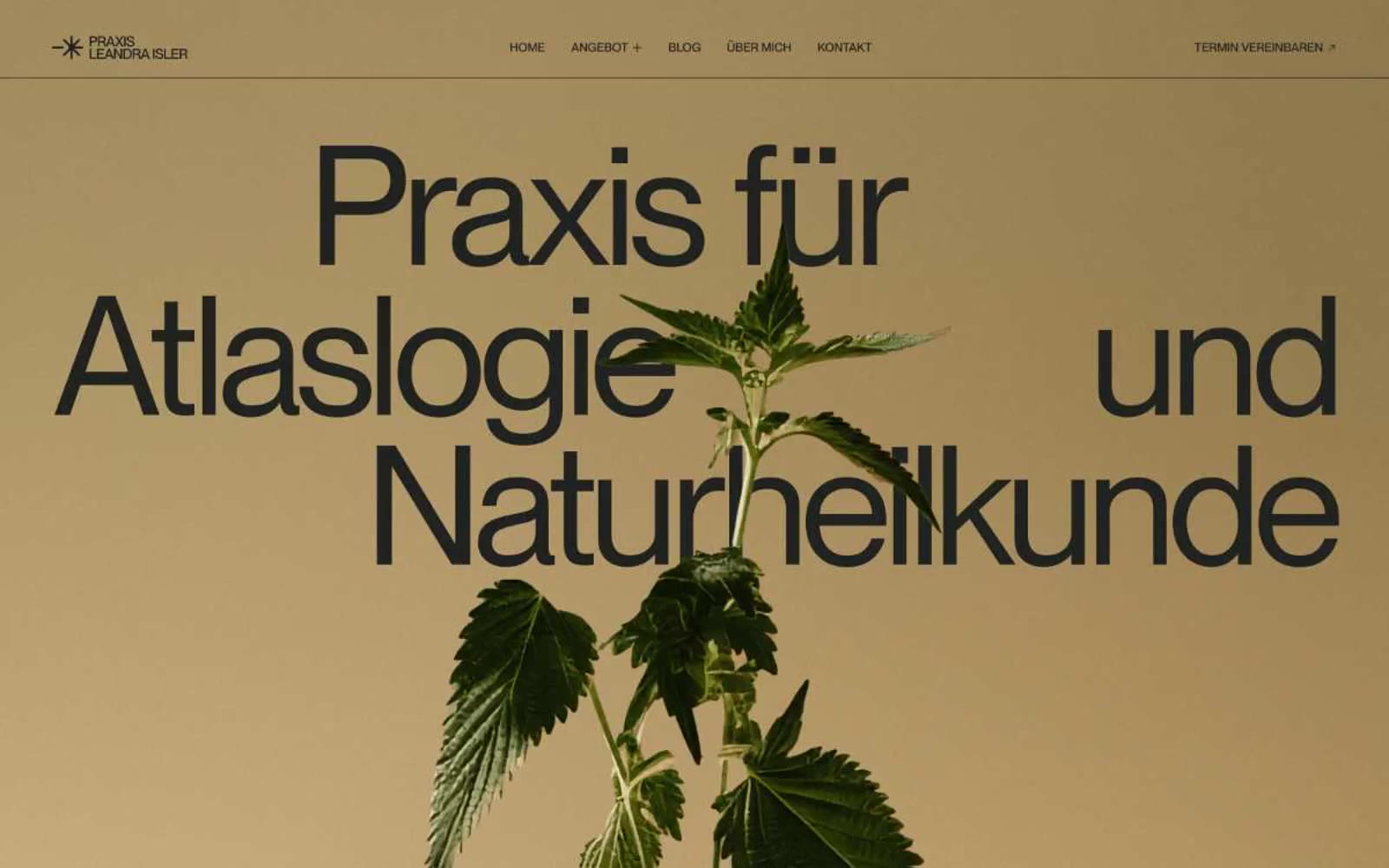
> dried botanicals pressed into warm vellum — calm, tactile, editorial, almost reverent.

**Theme:** light

Source measurements are normalized; roles and recommendations are interpreted. Font summary lists are independent, not paired by position. HTML examples are reconstructions, not source components.

Praxis Leandra Isler reads like a printed herbalist's broadsheet — a single warm sand canvas stretching edge to edge, interrupted only by a dark, almost-black typeface and the living green of a botanical photograph. The entire visual system is held together by a monochromatic earth palette: no competing UI colors, no decorative surfaces, no shadows. Typography does all the structural work, scaling from a 14px caption to a 173px display headline on the same single typeface, so the eye reads scale itself as hierarchy. Surfaces are flat and paper-like; the only "depth" comes from a soft vertical gradient that deepens the tone at the top, mimicking vellum under raking light. Every chrome element — nav, links, buttons — is a thin underline or a hairline rule, never a filled chip. The result is a contemplative, gallery-wall atmosphere where the plant is the hero and the interface gets out of the way.