# Deta Surf — Style Reference
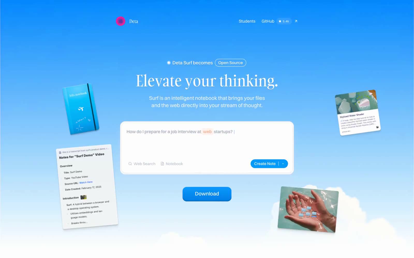
> Open notebook floating in a clear blue sky. A serif headline drifts above a pill-shaped search bar while tilted content cards orbit like ideas in a thought bubble.

**Theme:** light

Source measurements are normalized; roles and recommendations are interpreted. Font summary lists are independent, not paired by position. HTML examples are reconstructions, not source components.

Deta Surf treats the web like a cumulus notebook — a pale blue sky gradient carries the hero, content cards tilt and float at the edges, and the interface itself feels weightless. The signature typographic tension sits between Gambarino serif headlines and Switzer geometric sans: the words feel handwritten, the UI feels engineered. Tanker appears sparingly as an all-caps accent (16-19px, +0.05em tracking) on tags and small display elements, breaking the otherwise clean system with a crafted, editorial touch. Components hover rather than sit: cards carry a single hairline shadow at 5% opacity, filled buttons gain depth from a #006dc8 inset highlight, and the single brand blue (#009afc) appears only where the user must act. The whole system breathes — 8px base, generous 32px section gaps, 30px rounded hero search bar, and pill-shaped controls everywhere signal a contemplative, low-friction product.