# Atoms — Style Reference
> white atelier with one blue spark

**Theme:** light

Source measurements are normalized; roles and recommendations are interpreted. Font summary lists are independent, not paired by position. HTML examples are reconstructions, not source components.

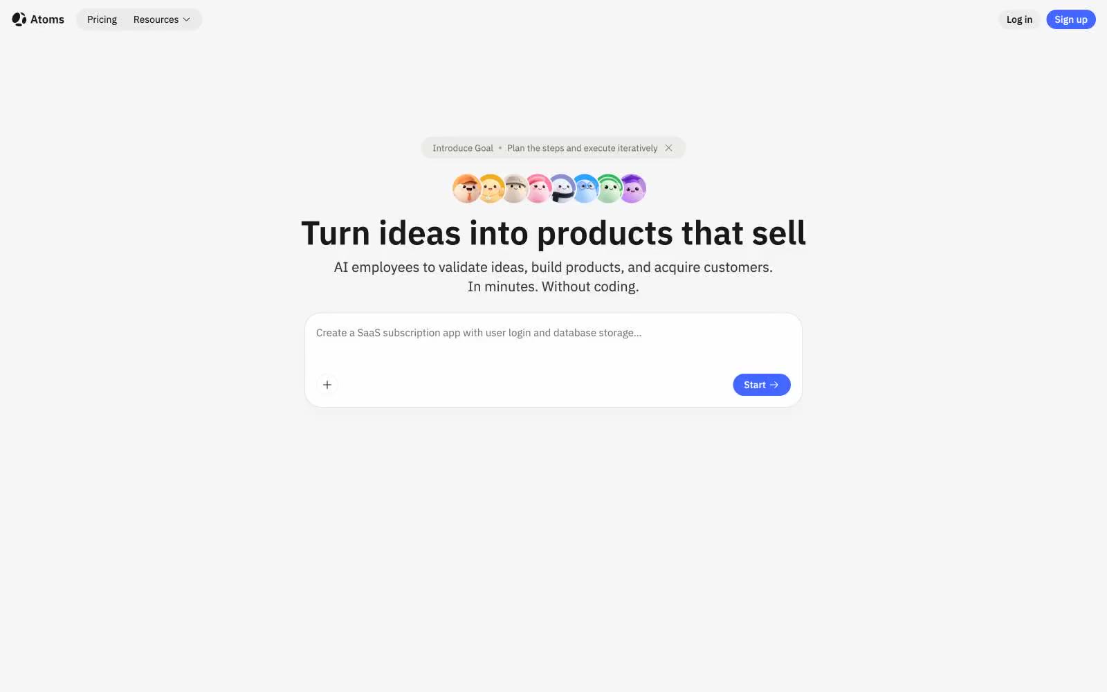
Atoms operates as a quiet workshop: near-white canvas, one confident blue-violet accent, and typography that lets content breathe rather than perform. The system is almost achromatic — gray is the structural material, and the single chromatic note appears only when something is actionable, linked, or wants to be named. Surfaces are flat and soft, cards float on barely-there shadows, and radii swing between fully pill-shaped (9999px) and generously rounded (24px) — never sharp, never heavy. IBM Plex Sans carries the UI at compact sizes while Plex Serif surfaces once, at 48px, giving the hero headline a literary weight that the product photography (template thumbnails with Mac chrome) deliberately undercuts with its playful, colorful content.