# Bento — Style Reference
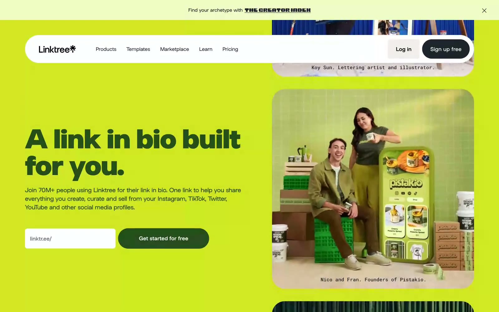
> bento lunchbox on sunlit linoleum. A grid of rounded, sticker-like cards in lime, lavender, cobalt, and maroon, each ringed with thick black ink, sitting on warm off-white linen beneath a confident geometric headline.

**Theme:** mixed

Source measurements are normalized; roles and recommendations are interpreted. Font summary lists are independent, not paired by position. HTML examples are reconstructions, not source components.

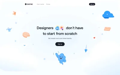
Bento speaks in a sunlit, pop-art bento-box language: full-bleed banded sections in lime, royal blue, and maroon stack vertically like a Japanese lunch tray, separated by generous white space on a warm linen canvas (#f3f3f1). The system is high-contrast and confident — thick black outlines wrap nearly every shape (1284+ black border occurrences), giving cards, buttons, and illustrations a hand-drawn, sticker-like quality that rejects soft shadows. Typography is tight and assertive: a custom geometric sans at up to 800 weight, with negative tracking that pulls display headlines into a single dense mass at 80px. The color palette is deliberately loud but disciplined — lime green is the single loud action accent, while maroon, royal blue, lavender, forest, cobalt, and gold serve as decorative section/card fills. Components lean pill-shaped (99px) and heavily rounded (64px, 32px), with small-radius (8px) exceptions for nav and inputs. The overall mood is playful, maximalist, and unapologetically graphic — a creator-tool brand that celebrates personality over neutrality.