# Helloivy — Style Reference
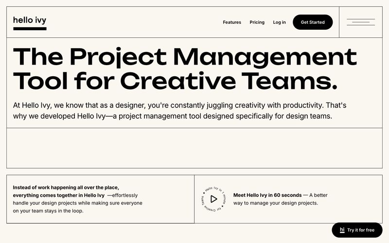
> Risograph-printed design journal on cream paper. A two-color editorial system where personality lives in typography, not color — the cream background, black ink, and one whisper-gray are the entire palette, and the quirky geometric display face carries all the brand energy the restrained palette deliberately withholds.

**Theme:** light

Source measurements are normalized; roles and recommendations are interpreted. Font summary lists are independent, not paired by position. HTML examples are reconstructions, not source components.

Helloivy uses a warm-cream editorial canvas with near-monochrome ink-black typography, giving the product a print-magazine feel rather than typical SaaS sterility. The display typeface (Unbounded) is geometric and slightly playful, carrying personality that the restrained palette deliberately withholds; Inter does the quiet labor of body, UI, and labels. Surfaces are flat — no shadows, no gradients — and the only elevation comes from filled black pills sitting on cream, or muted gray cards containing product commentary. Color is rationed: the cream canvas (#faf6f0) anchors the page, black owns headlines and primary actions, a single slate gray (#5e697f) handles secondary text, and white is reserved for product mockup surfaces. Everything else is space, type, and the occasional thin hairline border.