# Campsite — Style Reference
> Warm paper workspace — quiet, cream, and product-forward

**Theme:** light

Source measurements are normalized; roles and recommendations are interpreted. Font summary lists are independent, not paired by position. HTML examples are reconstructions, not source components.

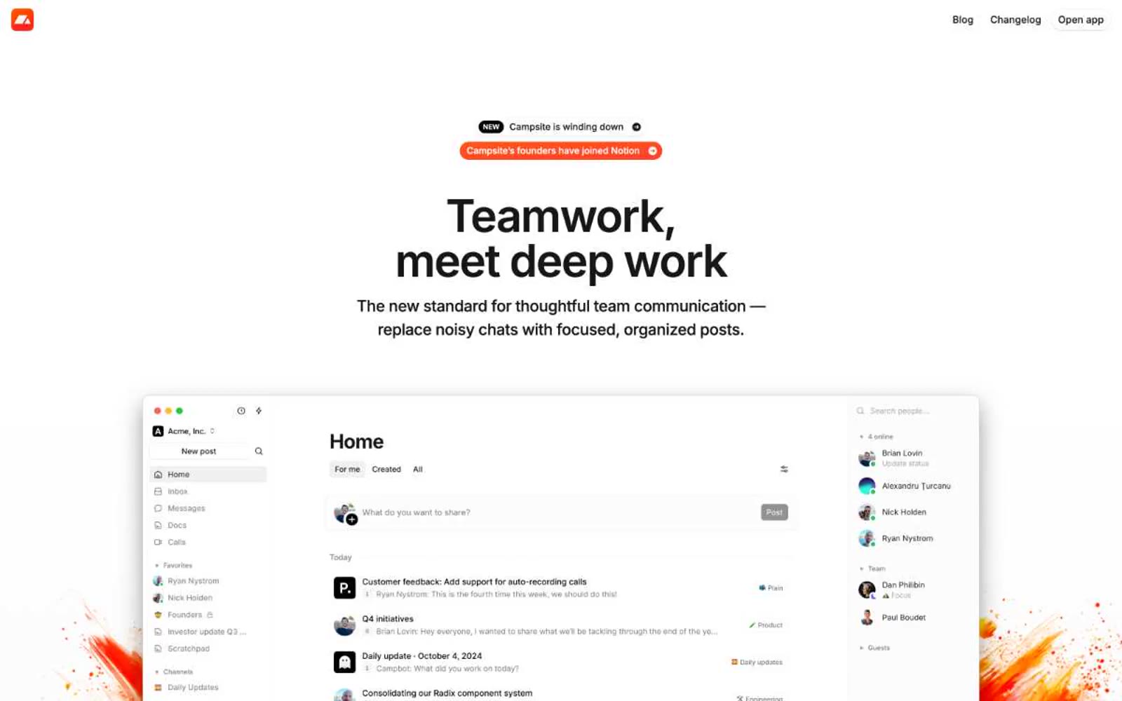
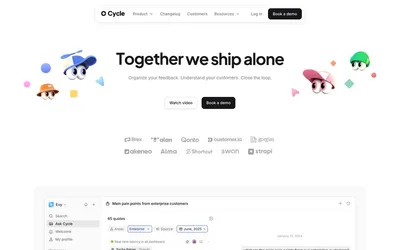
Campsite runs on warm minimalism: a cream-white canvas (#fffdf9) that feels like paper, paired with near-black text and almost no color. The interface is quiet, compact, and confident — Inter at every size, tight tracking on display sizes, pill-shaped controls, and soft elevation that barely lifts off the page. Color is rationed to functional punctuation: green for resolved states, a warm yellow wash for highlights, and a single dark-orange tone that lives in decorative paint-splash branding rather than in the UI itself. The product mockup is the hero — large, full-bleed, and dominant — while surrounding copy stays small and restrained, letting the product speak.