# Microsoft — Style Reference
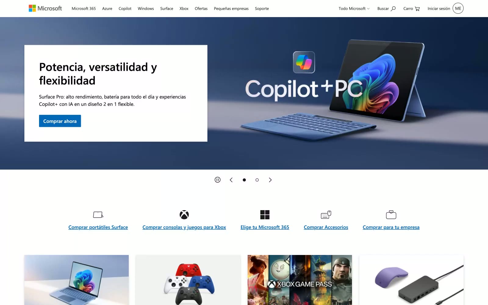
> Retail shelf behind plate glass — products float forward, chrome recedes.

**Theme:** light

Source measurements are normalized; roles and recommendations are interpreted. Font summary lists are independent, not paired by position. HTML examples are reconstructions, not source components.

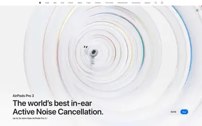
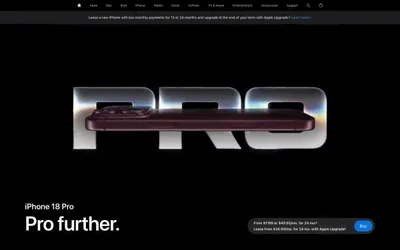
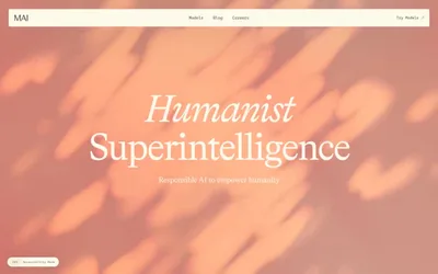
Microsoft.com reads like a department store catalog translated into pixels — functional, product-forward, and deliberately unshowy. The near-achromatic palette (colorfulness 2%) lets product photography and brand imagery carry all chromatic weight, while the UI itself stays out of the way. A single vivid blue (#0067b8) does everything — links, buttons, borders — appearing nowhere decorative, only interactive. Cards use a dual-layer shadow (rgba(0,0,0,0.13) 3px 7px + rgba(0,0,0,0.11) 1px 2px) against sharp 0px radius corners, a deliberate anti-trend choice that makes the surface feel like printed catalog tiles rather than floated app cards. Segoe UI at weight 400/600 across 11px–37px is the only typeface — no display cuts, no italics, no variable axes — enforcing a utilitarian uniformity across 56 interactive elements in a single header.