# Franco Maria Ricci Editore — Style Reference
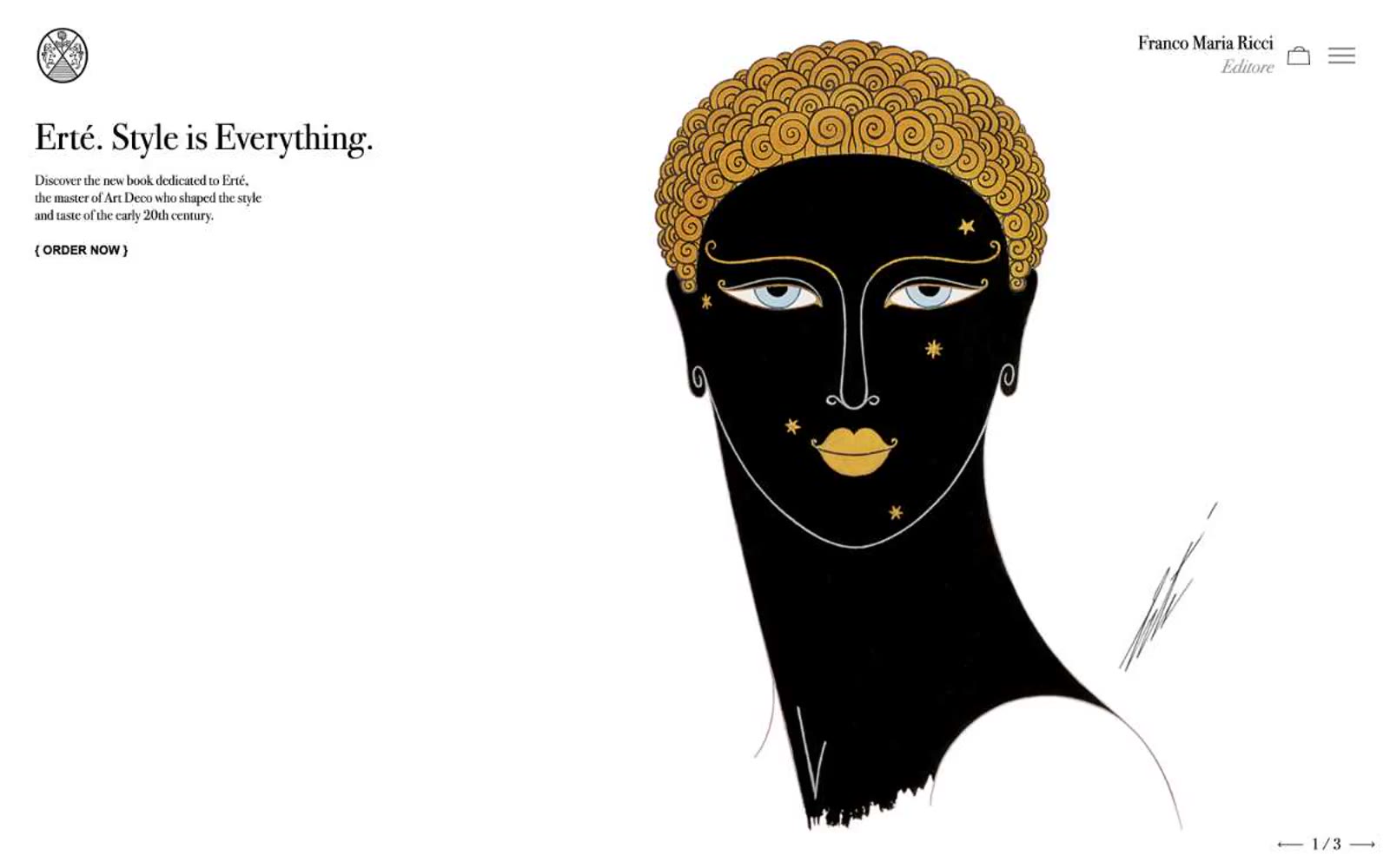
> Art Déco gallery catalogue — burnished gold hairlines on bone-white vellum

**Theme:** light

Source measurements are normalized; roles and recommendations are interpreted. Font summary lists are independent, not paired by position. HTML examples are reconstructions, not source components.

Franco Maria Ricci is a quiet luxury of typographic restraint: a vast off-white vellum, a single high-contrast Bodoni voice, and a thread of burnished gold that hairlines every editorial moment. The system behaves like an art-book spread — no shadows, no gradients, no rounded corners, no filled buttons — only the architecture of type, generous white space, and vertical rules dividing book objects. Color appears as gold punctuation (borders on titles, rules beneath section headers, thin lines under links) rather than as fill, and the lone dark surface (#0a0a0a) reads as a gallery wall, not as a UI mode. All interactive elements are text-driven: ghost links, bracketed call-to-action markers like `{ ORDER NOW }`, and pagination arrows at page corners. The page is a long horizontal editorial scroll divided into discrete exhibition rooms, each introduced by a serif italic section title with a gold underline.