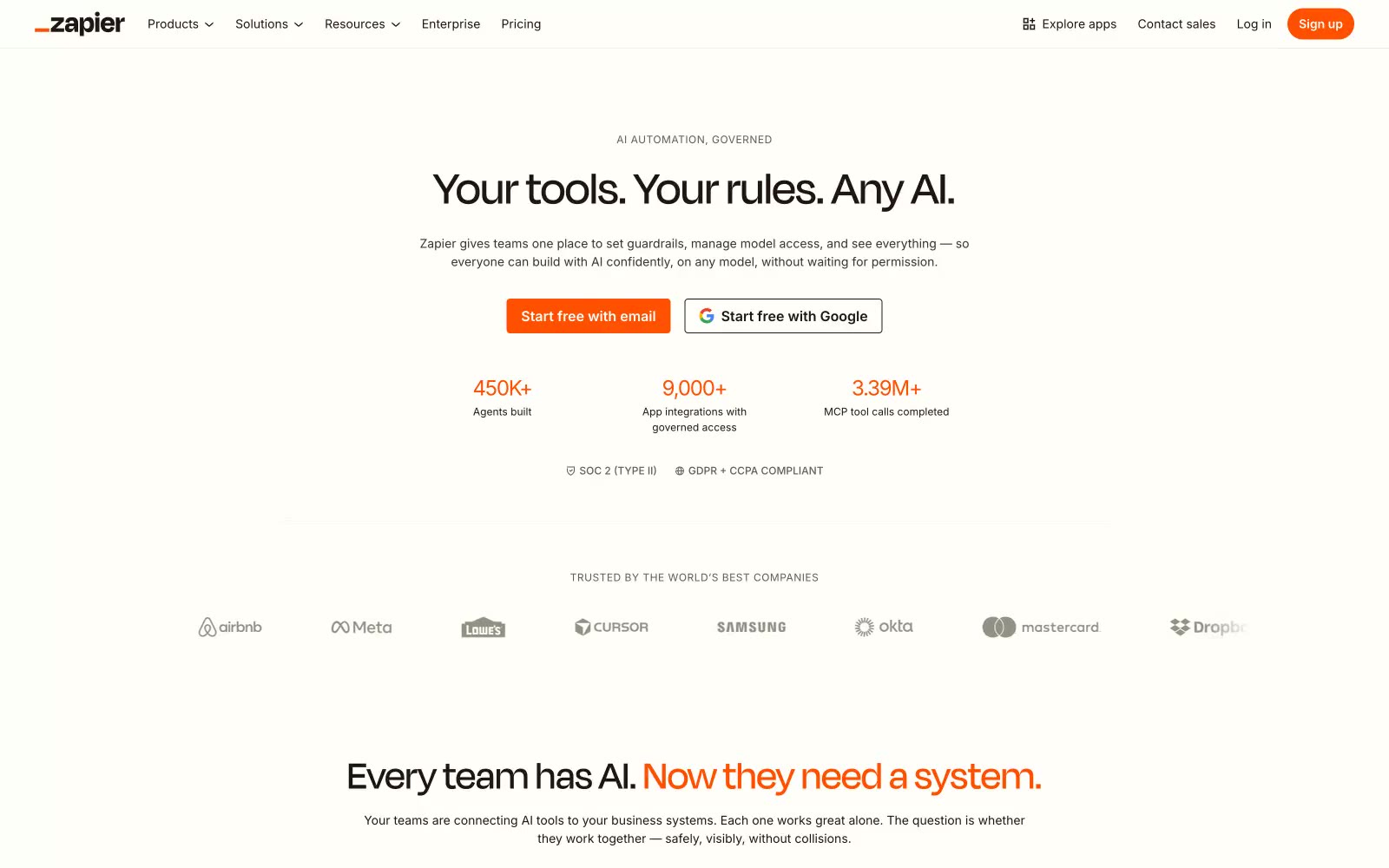
# Zapier — Style Reference
> sunlit maker's notebook. A warm cream canvas with paper-thin surfaces, a single vivid orange that powers every connection, and editorial typography that reads like a design magazine rather than enterprise software.

**Theme:** light

Source measurements are normalized; roles and recommendations are interpreted. Font summary lists are independent, not paired by position. HTML examples are reconstructions, not source components.

Zapier reads like a sunlit maker's notebook rather than enterprise software: a warm cream canvas (#fffefb, #f8f4f0) replaces the usual stark white, and text sits in warm near-blacks (#201515, #36342e) rather than cool blue-grays. Typography pairs Inter for UI with Degular Display, a custom face that runs positive letter-spacing counter to most display type's tightening instinct, and GT Alpina — a weight-250 serif that lifts select headings into editorial territory. One vivid orange (#ff4f00) punctuates brand marks and filled button surfaces; a deep violet (#2b2358) appears only inside illustrations. Surfaces are paper-thin — hairline borders, almost no elevation, pill-shaped controls at 20px radii — and spacing follows a 4px rhythm with generous breathing room between sections. The overall mood is approachable, editorial, and human: automation framed as craft, not as cold infrastructure.