# IFTTT — Style Reference
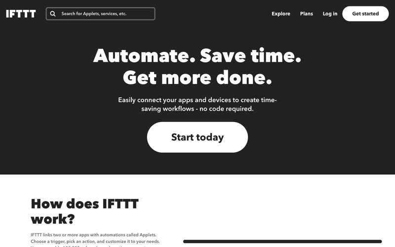
> Editorial darkroom with neon service tiles. A near-black gallery wall where each connected app brings its own paint.

**Theme:** dark

Source measurements are normalized; roles and recommendations are interpreted. Font summary lists are independent, not paired by position. HTML examples are reconstructions, not source components.

IFTTT reads as a dark editorial canvas punctuated by full-bleed brand-colored service tiles — the architecture is almost monochrome (#222222 canvas, white text, hairline borders) and then service tiles detonate in their native brand colors (Spotify green, YouTube red, Google blue). The visual system trusts geometric Avenir Next at confident sizes: 68px italic display heads with positive tracking, mid-weight body, and one-weight family across the whole stack. Primary action language is the pill: 100px radius, white fill, black text — repeated in inverse for the nav. Cards are flat, borderless, and color-as-surface rather than colored borders. The hero is a single dark band with centered display text and a solitary pill — no decoration, no gradient, no illustration.