# Raise — Style Reference
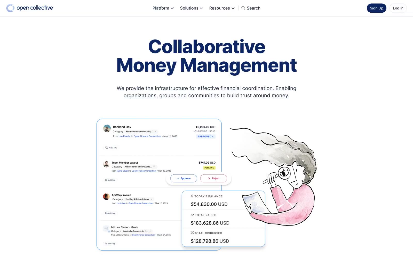
> sunlit open ledger — a near-white page with a single deep-navy headline and a hand-drawn illustration pulling warmth into a financial interface.

**Theme:** light

Source measurements are normalized; roles and recommendations are interpreted. Font summary lists are independent, not paired by position. HTML examples are reconstructions, not source components.

Open Collective's design language is a sunlit open ledger: a near-white canvas, hairline cool-gray dividers, and one deep navy that does all the chromatic work. Headlines carry the brand — oversized, weight 800, tightly tracked Inter at 60–72px — sitting directly on white with no panel behind them, so type itself becomes the hero. Body copy stays in a compact, near-black ink, never pure black, giving the financial content a softer documentary feel. Soft watercolor illustration breaks up the financial density with human warmth; UI chrome stays minimal, with 12px radii and a single subtle card shadow. Color is rationed like ink: the navy is the only saturated hue, used for headings, primary actions, and the brand mark — everything else is neutral.