# Glyphs — Style Reference
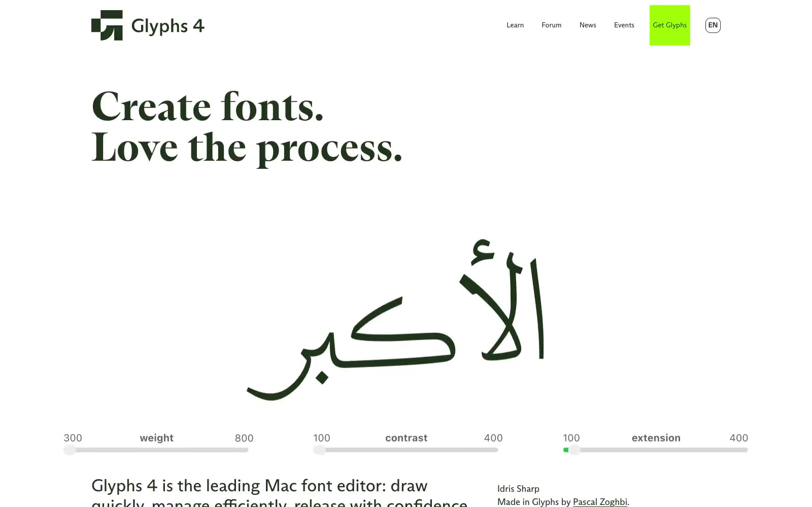
> A letterpress workshop under neon light. Build white, spacious editorial compositions where exact vector-editing imagery is interrupted by bright color slabs and monumental letterforms.

**Theme:** light

Source measurements are normalized; roles and recommendations are interpreted. Font summary lists are independent, not paired by position. HTML examples are reconstructions, not source components.

Glyphs combines a white editorial canvas with oversized, high-contrast serif lettering and exposed type-design mechanics: Bézier handles, giant translucent glyphs, and application canvases remain visible rather than being hidden behind product mockups. The palette works in loud rectangular blocks—acid lime, cyan, orange, mustard, and deep cherry—while the surrounding page stays predominantly white and quietly spaced. One custom typeface spans every role, making navigation, editorial display copy, and UI annotations feel like outputs from the same font-making environment.