# Fabric — Style Reference
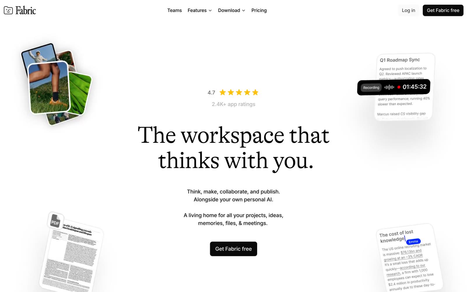
> editorial manuscript on a drafting table

**Theme:** light

Source measurements are normalized; roles and recommendations are interpreted. Font summary lists are independent, not paired by position. HTML examples are reconstructions, not source components.

Fabric uses an editorial-document language: white canvas, near-monochrome surfaces, and a single editorial serif headline that gives the workspace a literary, almost manuscript-like gravity. The product lives in a tight grayscale world — black text, white surfaces, hairline borders, and almost no color — punctuated by a single vivid electric-violet glow that appears as soft shadows, focus halos, and accent washes rather than fills. Inter handles all UI and body text at compact, confident sizes, while GT Alpina Light whispers the brand promise in weight-300 serif at 80px. Components are paper-thin: cards with 16px radii, dark filled CTAs (#0a0a0a) with 8px radii, ghost links drawn in deep indigo with a 1px underline, and shadows so subtle they register as paper grain rather than elevation. The system feels like a writer's drafting table — calm, restrained, deeply considered, with one bright violet mark on the page.