# Mews — Style Reference
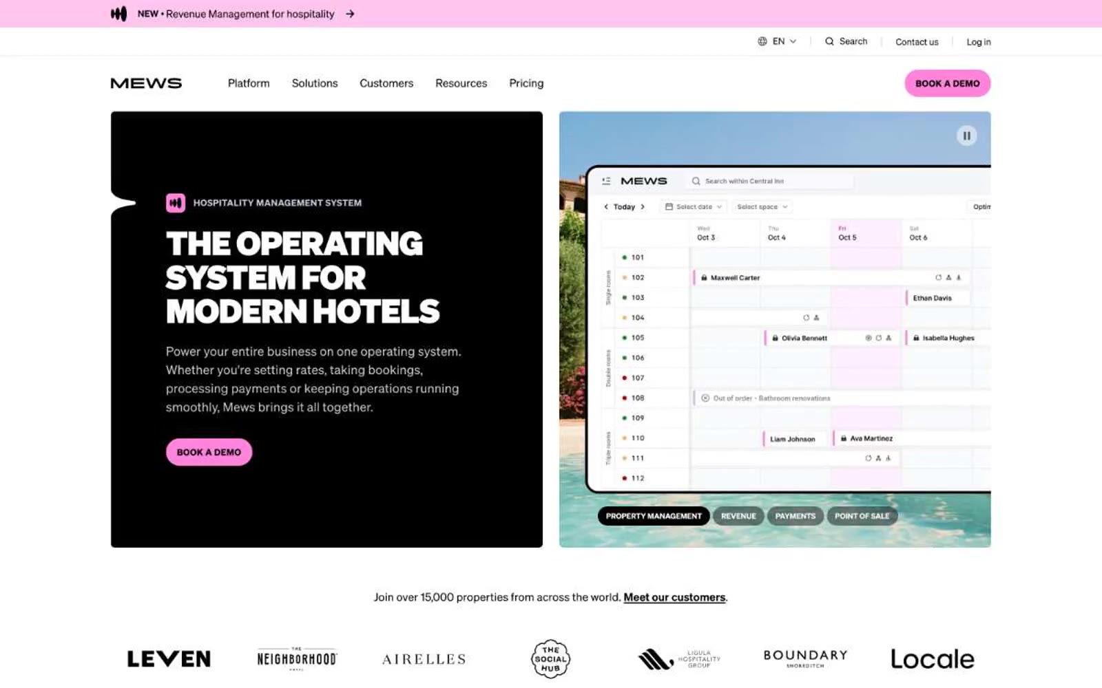
> Hospitality command center at pink dawn. A white-walled, sunlit workspace where bold black type, warm cream cards, and a single candy-pink action button define every screen — playful confidence over enterprise restraint.

**Theme:** light

Source measurements are normalized; roles and recommendations are interpreted. Font summary lists are independent, not paired by position. HTML examples are reconstructions, not source components.

Mews operates as a hospitality command center bathed in pink dawn: a predominantly white canvas, warm cream card surfaces, and a saturated candy-pink accent that drives every primary action. The visual language is unapologetically confident — headlines render at extreme weights (900) at display sizes, pushed tight with aggressive negative tracking, while body copy sits in a comfortable 400-weight Soehne. Surfaces stay flat and minimal; the few chromatic moments (soft pink, ice blue, lime green) are reserved for categorical tiles, product UI highlights, and the signature pill-shaped CTA. The result reads as a modern operating system for hotels: structured, optimistic, slightly playful, and decidedly not corporate-grey SaaS.