# Portrait — Style Reference
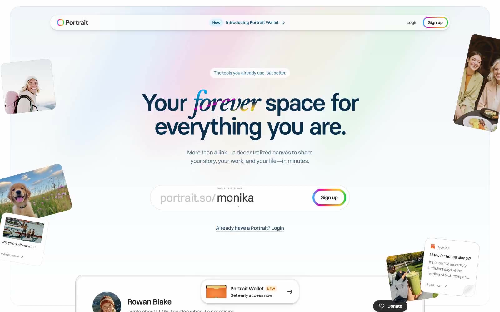
> polaroid memory wall on cream paper. A bright, off-white scrapbook where deep-navy ink provides the only text, the only structural lines, and the only border color — with a single hand-drawn rainbow that appears once, on the Sign up button and on the italicized word forever, and never again.

**Theme:** light

Source measurements are normalized; roles and recommendations are interpreted. Font summary lists are independent, not paired by position. HTML examples are reconstructions, not source components.

Portrait is a sunlit, deeply personal canvas for identity: a near-white page where a single deep-navy ink carries almost all text and structural lines, and color appears only as warm pastel surface washes or a signature rainbow that bleeds through italicized words, button borders, and small decorative strokes. The type system is two-voice — Switzer for steady UI, Basier Circle for giant display headlines that compress tight against each other — and the geometry favors generous rounding (24px cards, 28px pill buttons) with barely-there shadows that let content float rather than stamp itself. Everything reads like a scrapbook: scattered tilted photo cards, mint and peach and sky-blue tints, a thin rainbow border around the Sign up button, and a sticky pill nav that hovers above the page with a whisper of elevation. The overall density is comfortable, the rhythm is calm, and the brand voice is warm but restrained — let the user be loud, keep the frame quiet.