# Touchy Coffee — Style Reference
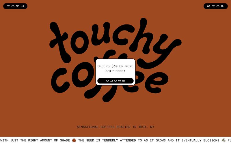
> Hand-painted coffee zine — earthy paint bands, typewriter labels, and extreme pill buttons on warm matte surfaces.

**Theme:** mixed

Source measurements are normalized; roles and recommendations are interpreted. Font summary lists are independent, not paired by position. HTML examples are reconstructions, not source components.

Touchy Coffee operates like an indie zine meets corner coffee shop: a rotating cast of earthy, hand-mixed backgrounds (terracotta, sage, sky blue) where the product photography and a bouncy custom script logo do the heavy lifting, and the UI chrome stays deliberately lo-fi. Everything readable is set in Apercu Mono — a monospaced face that reads like a typewriter label, reinforcing the craft, small-batch identity over glossy e-commerce polish. Controls are extreme pills (100px radius), cards are softly rounded (20px), and the color system behaves like a set of paint swatches — lavender, terracotta, moss green, sage gray — applied to full-bleed section bands rather than used as accent dots. Borders are bold and black, text is unapologetically black-on-color, and the overall effect is tactile, warm, and personal rather than slick or optimized.