# Motto® — Style Reference
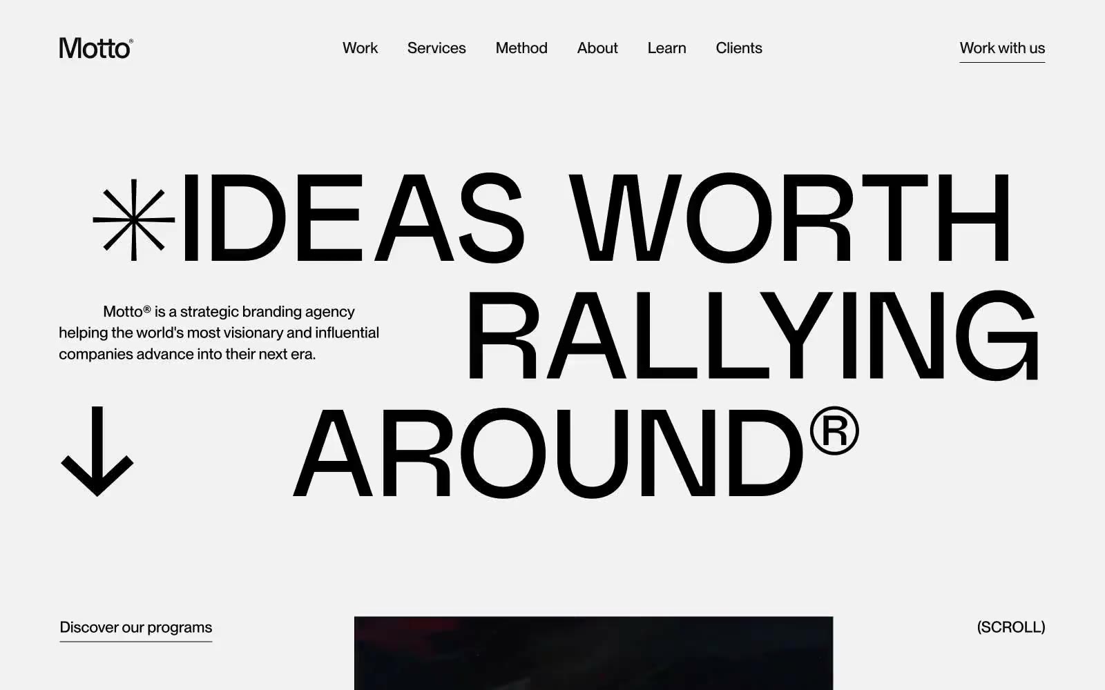
> Typographic monolith on paper — a single confident voice announcing itself on bone-white stock.

**Theme:** light

Source measurements are normalized; roles and recommendations are interpreted. Font summary lists are independent, not paired by position. HTML examples are reconstructions, not source components.

Motto® speaks in pure typographic voice: a light gray canvas, no chromatic accents, no shadows, and no decorative graphics — only two typefaces, generous whitespace, and the confidence to let a 154px headline carry an entire screen. Weight 500 is used everywhere; nothing is bold, nothing is light, so hierarchy comes from size, tracking, and whitespace rather than visual weight. Interaction is reduced to underlined text and pill-shaped controls (9999px radius), and the ® mark and asterisk-burst function as the only brand motifs. The result is a site that reads like an editorial spread rather than a product page — monochrome, declarative, and structurally disciplined.