# TOMO — Style Reference
> torn zine pages taped to a fridge — flat, warm, and unapologetically analog.

**Theme:** light

Source measurements are normalized; roles and recommendations are interpreted. Font summary lists are independent, not paired by position. HTML examples are reconstructions, not source components.

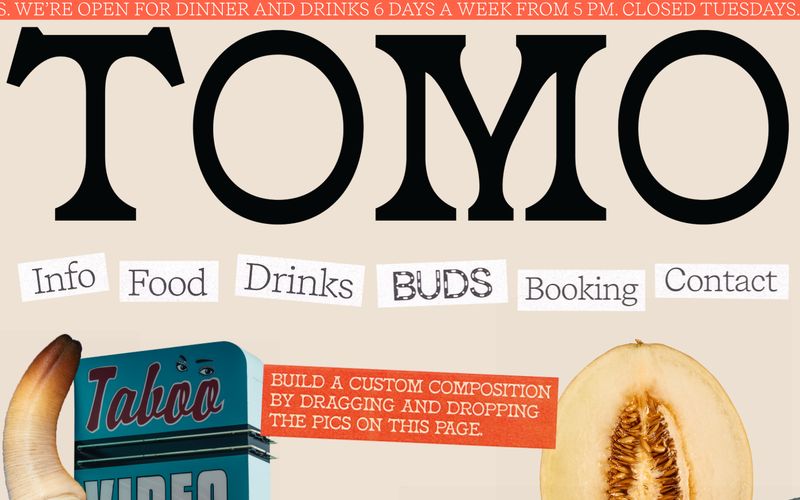
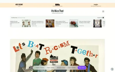
TOMO reads as a printed zine taped to a refrigerator — warm linen canvas, oversized serif display type, torn-paper navigation stickers, and tomato-red marquee banners. Every surface is flat: no shadows, no gradients, no elevation. The visual grammar is collage, not card grid: food photography, street photography, and rubber-stamp typography layered freely on a cream page, anchored by razor-thin black borders. Recife's high-contrast serif does the heavy lifting at 80–120px scale while body stays small and functional. A single accent — tomato red — arrives as a marquee ribbon and stamp ink, never as a button fill. The system refuses the conventions of restaurant websites: no menus in accordions, no reservation widgets floating mid-page, no color-coded CTAs.