# Faire ES — Style Reference
> warm cream wholesale catalog

**Theme:** light

Source measurements are normalized; roles and recommendations are interpreted. Font summary lists are independent, not paired by position. HTML examples are reconstructions, not source components.

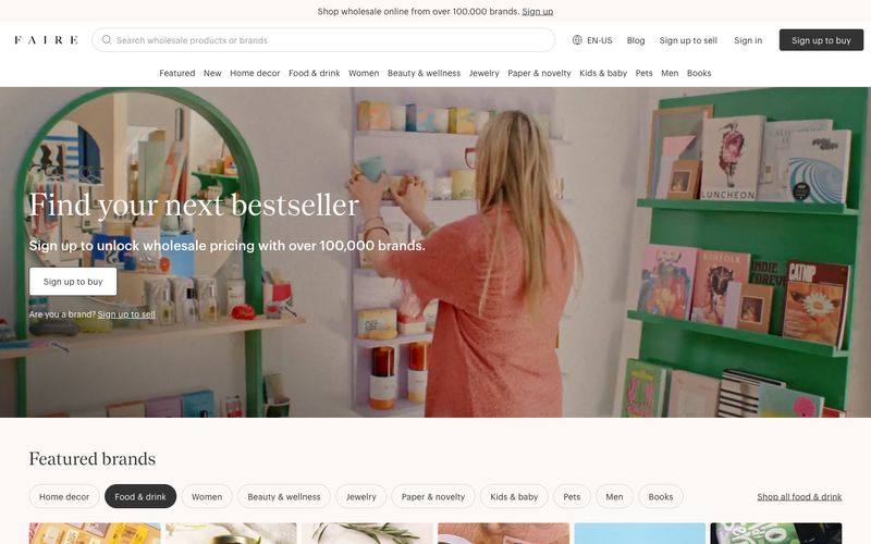
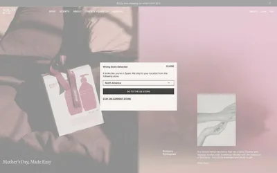
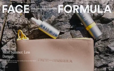
Faire reads like a printed wholesale catalog digitized — warm cream paper (#fbf8f6) as the canvas, a whisper-thin geometric sans (Graphik 100) for body and a high-contrast serif (Nantes) for editorial headlines, almost zero chromatic noise, and one pale buttery yellow (#f1f29f) used as a decorative underline accent rather than a functional call-to-action. The whole interface is achromatic: the brand 'Sign up to buy' button is matte black, the secondary 'Sign in' is ghost, category nav pills use a generous 40px radius, and the 4px button radius keeps control elements grounded and rectangular against the otherwise pill-shaped navigation. Imagery carries all the warmth — full-bleed lifestyle photography of boutiques, shelves, and product stills — while the UI stays quiet, editorial, and whitespace-driven, letting merchants' products feel curated rather than marketed.