# Era — Style Reference
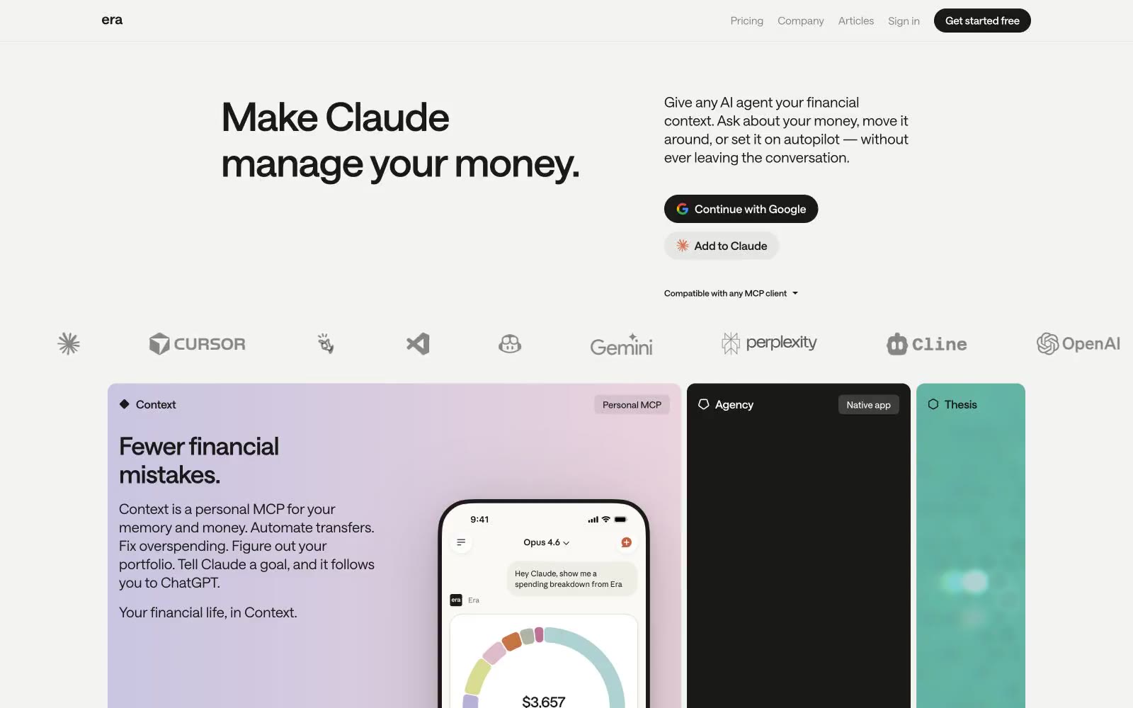
> Quiet ledger on warm paper

**Theme:** light

Source measurements are normalized; roles and recommendations are interpreted. Font summary lists are independent, not paired by position. HTML examples are reconstructions, not source components.

Era operates in a near-monochrome editorial register: a warm parchment canvas, ink-black typography, and just enough chromatic punctuation — a soft lavender wash, a teal panel, a black card — to make three product surfaces feel like distinct chapters in a printed financial document. The visual system privileges typographic confidence over decoration: a custom variable sans-serif at tight negative tracking carries all the weight, and the interface stays text-first, with components reduced to pill buttons, hairline borders, and flat cards with zero shadow. Every screen should feel like a well-typeset magazine spread — quiet authority, generous whitespace, and color appearing only when a surface needs to announce itself as a distinct product. Density is comfortable, not dense; the rhythm comes from large headlines and 16px padding breathing inside cards, not from packed information rows.