# 7shifts — Style Reference
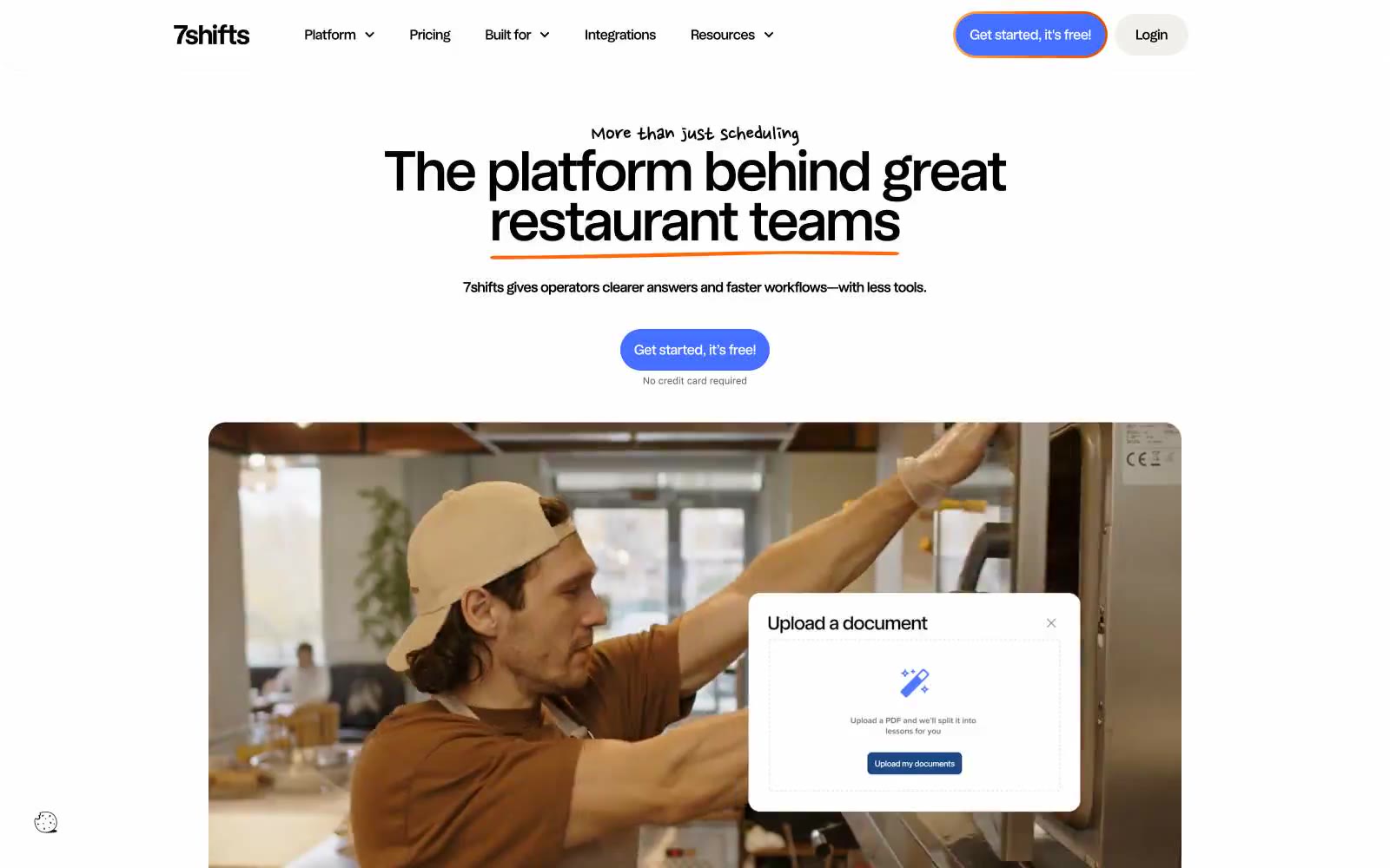
> warm diner counter with neon chalk accents — a bright restaurant counter where indigo buttons, orange hand-drawn underlines, and lime highlighter marks sit on clean white and warm bone surfaces, with occasional black bands that make the colors glow.

**Theme:** light

Source measurements are normalized; roles and recommendations are interpreted. Font summary lists are independent, not paired by position. HTML examples are reconstructions, not source components.

7shifts is a light, air-kissed SaaS canvas with a single punchy indigo as the call-to-action and a small cast of warm accents doing the personality work. The page reads like a clean restaurant counter: white surface, warm bone secondary panels, soft pastel card variants, and the occasional full-bleed black band that makes everything around it feel brighter. Orange is the signature flourish — it underlines hero words in a hand-drawn stroke, floods feature backgrounds, and marks tabbed content — while a lime-green acts as highlighter text inside dark sections. Components are generous and rounded (pill buttons, 20px cards, 40px hero plates) with a compact vertical rhythm. The lone script typeface, Nanum Pen Script, shows up only as a personality accent under hero copy and never on body or UI controls.